Drive Your Story Home with the Best Fit Visualizations
How you present your data matters. As a data analyst, it is important to determine which tools are most appropriate for the story you are trying to tell your audience. Incorporating data visualizations, graphs, infographics, charts, and tables can help to convey and drive a story home. However, the visualizations you use, or don’t use, can make all the difference when it comes to decision-making outcomes. Visuals catch attention and are processed 60x faster than text. As a result, it is important that the visualization is direct, meaningful, and intuitive. Meaning, your audience can effectively and efficiently interpret the visualization and understand its value.
How to Build:
Using Lab Prototypes in Adobe Analytics, you can leverage the Visualization Recommender. This prototype recommends visualizations that pair well with your data. All you must do is select the desired metrics and dimensions (up to 10 total).
- Go to Adobe Analytics > Labs > Visualization Recommender
- Select the relevant dimensions and metrics you are looking to visualize.
- Click “Build.”
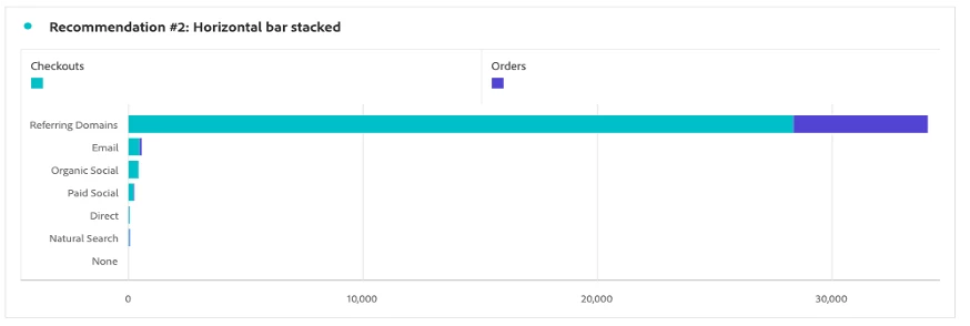
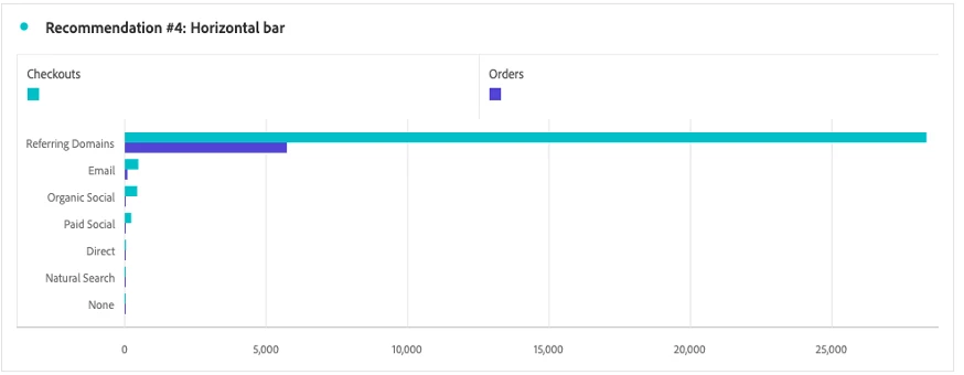
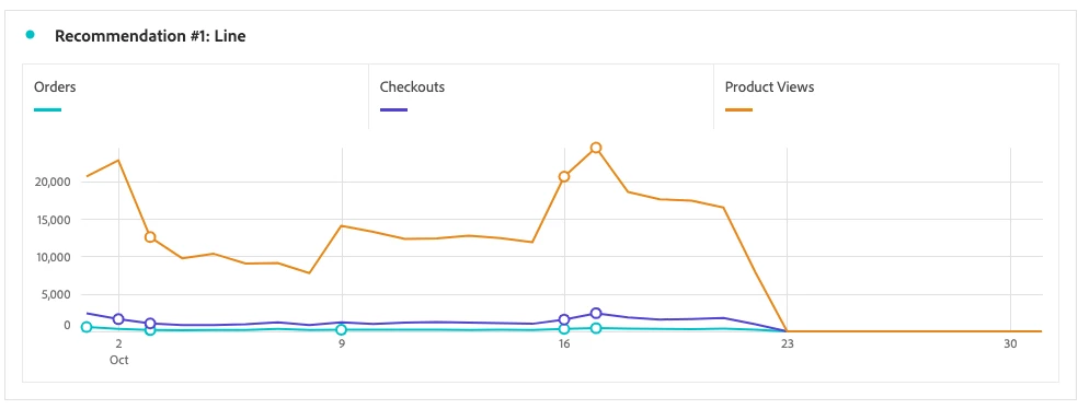
Visualization Recommender will process the request and offer one or more suggestion to find the most fitting data visualization to better tell your story, as shown in the examples below:
Example #1:
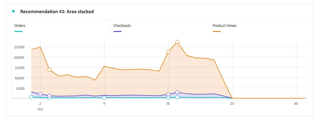
Example #2: