Unify the Approval UI Designs and Emails
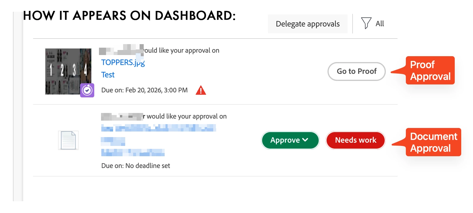
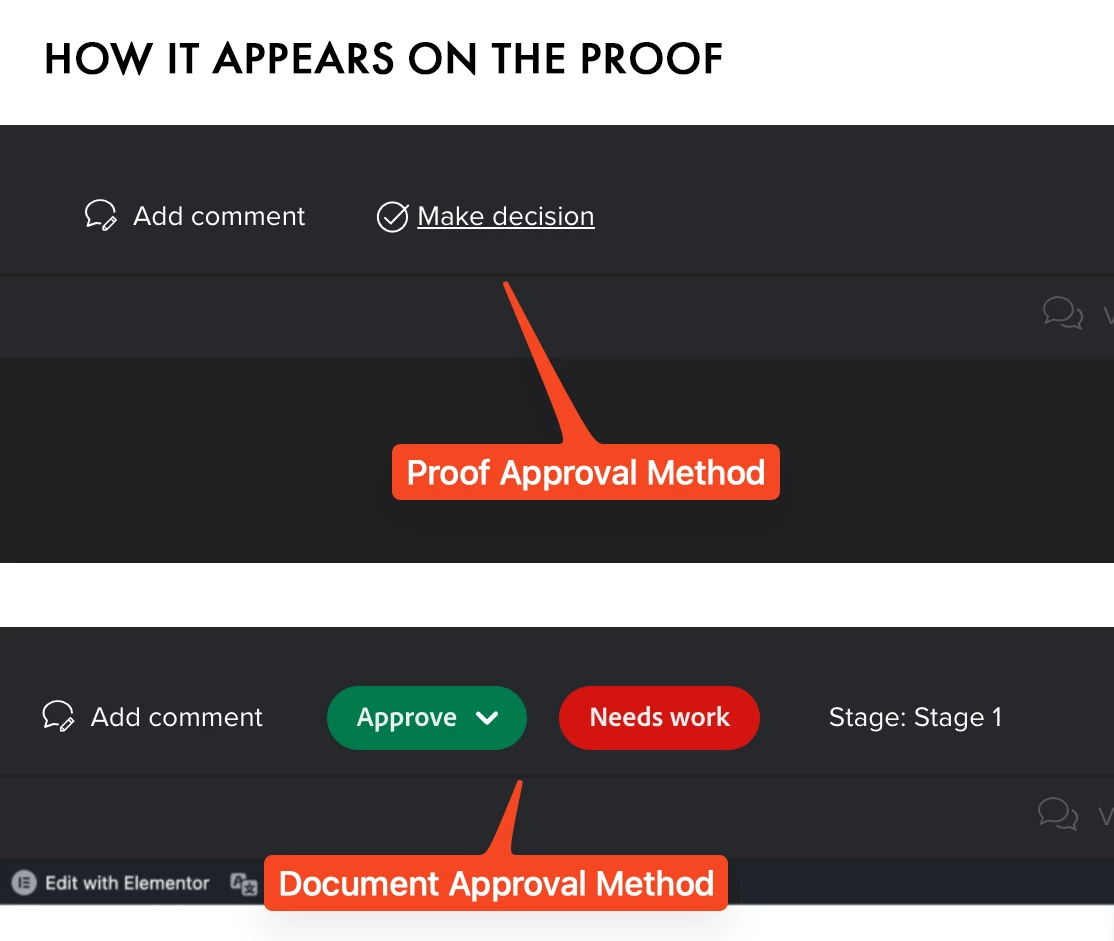
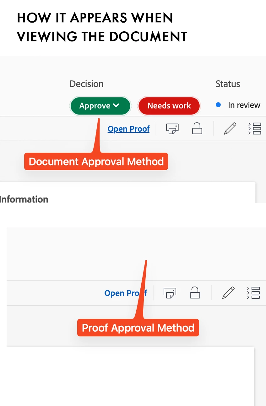
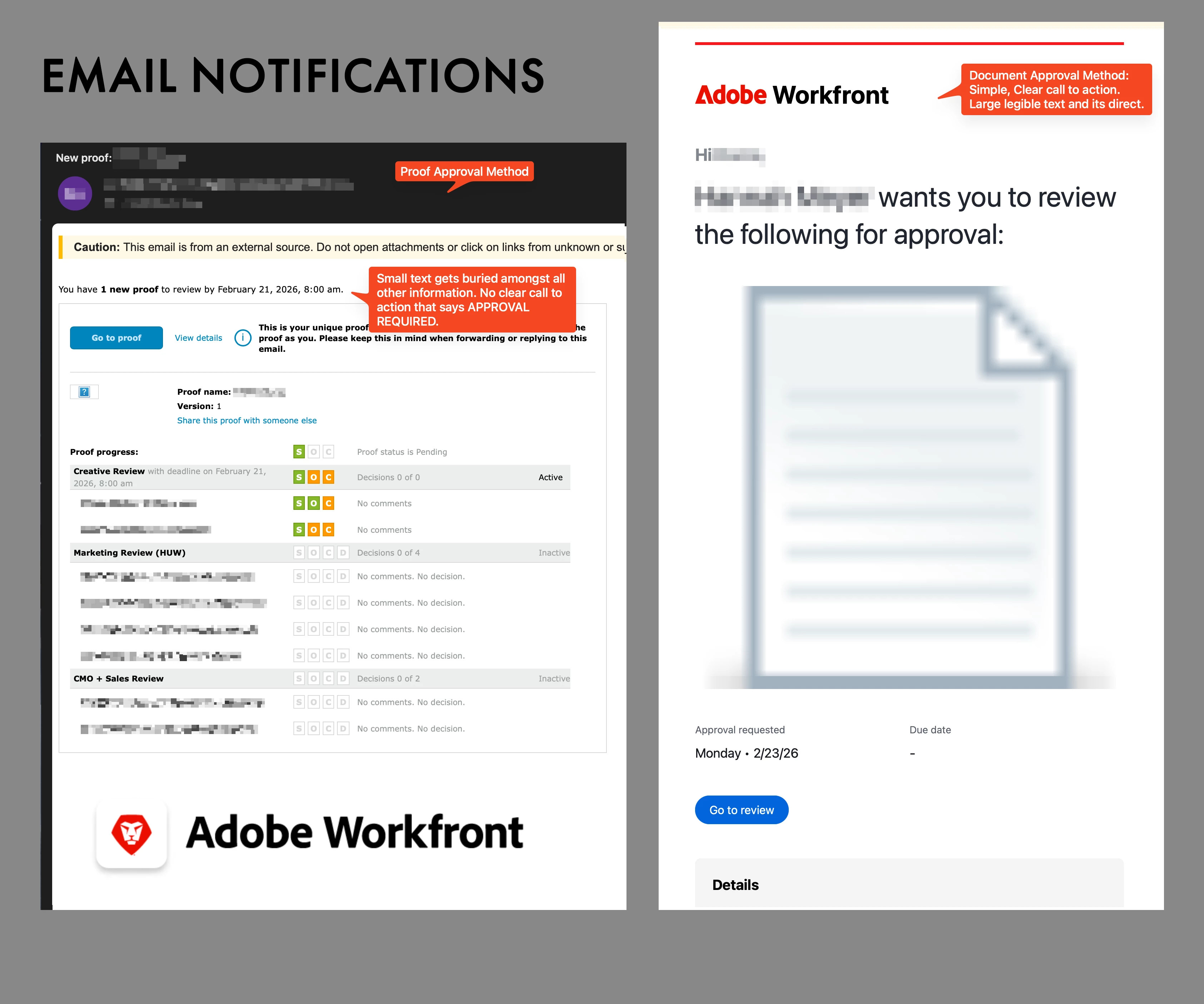
We often used the Document approvals for our proofs - was easier for us. But due to a certain issue/bug we’ve been somewhat forced to learn to do it via the Proof Approval method (via the ProofHQ way). I’ve noticed visually there’s a big difference and I much prefer how the Document approvals display. The red and green buttons for approvals let the users know right away where to click to make their decision. I am hoping the Proof Approvals can soon match the UI of the other approval method in the future. It feels cleaner and more direct on what the reviewers are supposed to do. Even the email notifications show a big difference. I wish there was a way to change the font size on the Proof notifications because any message sent has such a small font and immediately followed by the proof’s information that people start to just disregard after some time.
Below are screenshots with direct comparisons: