Question
Planned vs Actual hours chart
Can anyone give a recommendation for how to display planned vs. actual hours variance in a chart format? It needs to be a simple visual as the final chart/report will need to be shared with leadership.
Right now, the planned hours formatting is showing as crazy high because of the way the system calculates. See attached screenshot.
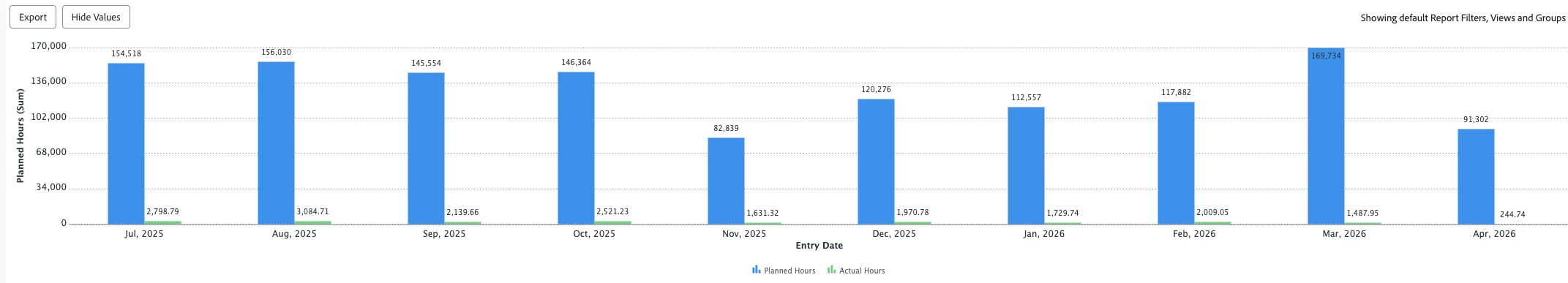
Any advice?