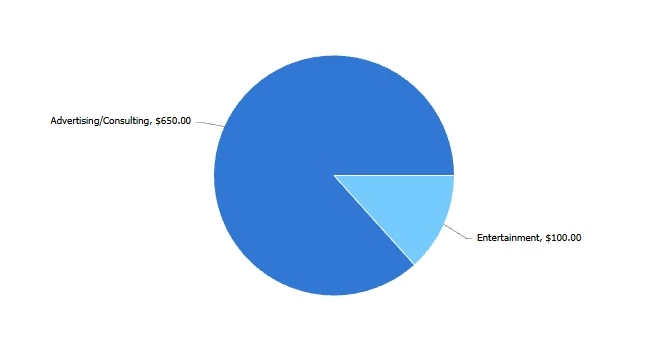
I was wondering, is there any way to combine/sum f few expense types and display that sum as a wedge in a piechart. I need to sum up a few different expense types and show those against one different expense type. So 2 wedges in a piechart, one of them is ths sum of a few expense types and the other is just one.
Charts work off of your “groupings,” and the values can be aggregated based on that grouping, and you can’t group groupings. Additionally, pie charts only work with a single grouping.
Essentially, what you are trying to do isn’t possible natively within reporting, so you will need to set up your expenses to capture the data the way you need it to display in your chart and then report on it.
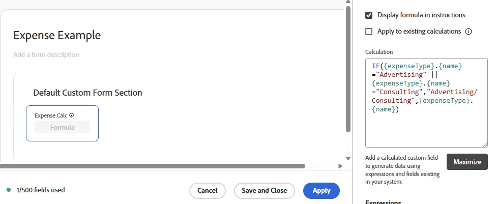
@Richard_Le_ has a great suggestion. An additional option would be to use calculated fields on the custom form to capture your values for expense types.
In plain Language, if the expense name is Advertising or Consulting, return the value of “advertising/consulting” otherwise just give me the expense name.
@KellieGardner @Richard_Le_ @Sven-iX @MoniqueEvans @Gokul_Agiwal Wanted to loop you in and see if you have any perspective or lessons learned that could help us here. Your insight would be helpful, thank you!
Simplest approach here would be to create a custom form for expenses. On that form you would have a field that is used to categorise the expenses into the two “wedges” you want to display on your chart. Then simply build an expense report that is grouped by that custom field to visually represent the data how you see fit.
Charts work off of your “groupings,” and the values can be aggregated based on that grouping, and you can’t group groupings. Additionally, pie charts only work with a single grouping.
Essentially, what you are trying to do isn’t possible natively within reporting, so you will need to set up your expenses to capture the data the way you need it to display in your chart and then report on it.
@Richard_Le_ has a great suggestion. An additional option would be to use calculated fields on the custom form to capture your values for expense types.
In plain Language, if the expense name is Advertising or Consulting, return the value of “advertising/consulting” otherwise just give me the expense name.