
Best way to report the counts of selections from a multi-select field | Community
Skip to main content
Jared_Mauch
Level 6
July 9, 2026
Question

Best way to report the counts of selections from a multi-select field

  • July 9, 2026
  • 1 reply
  • 24 views

I’m trying to figure out the best way to report on the counts of selections made on a multi-select field for projects. There is currently a calculated field on the project form to capture choices, but that created entries on the report like “Choice 1, Choice 2”, “Choice 1, Choice 3, Choice 4” etc. Stakeholders are asking to segment them out individually. It sounds like I might have to make individual calculated fields for each of the 15 choices on the multi-select field. Am I on the right path to try and capture this data?
1 reply

Lyndsy-Denk
Community Advisor
Community Advisor
July 10, 2026

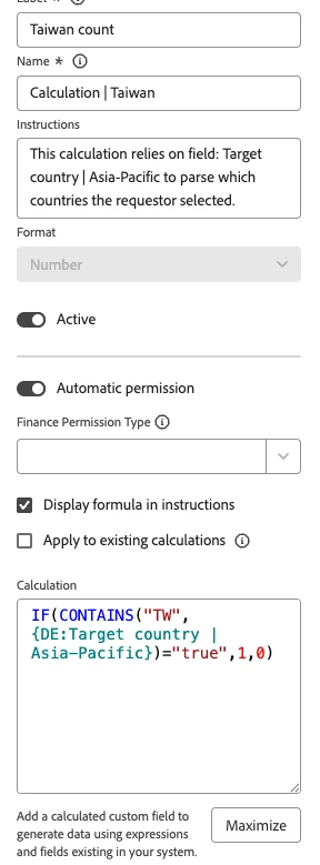
Yup, you need a calculated field to count each instance of the selection. See attached for a screenshot of one of mine that counts the number of times a country was selected in the form. Reminder (because I’ve forgotten and had to redo work): Your calculated field must be a Format of Number to do the math. Additionally, the CONTAINS formula looks for the choice value, not the name. In the example below, the choice value (not shown) is “Taiwan” but the value is “TW”.

Because these calculations can become numerous and unwieldy, I’ve created a separate admin/reporting form that most users can’t see. That way it works in the background without cluttering what users see.

IF(CONTAINS("TW",{DE:Target country | Asia-Pacific})="true",1,0)


Jared_Mauch
Level 6
July 10, 2026

Thanks for the confirmation. I have an admin section break on the custom form that I was planning on putting these new calculated fields in to limit the clutter others can see. Will I have to create separate reports for these calculated fields or is it possible to show the totals combined in a pie chart or bar graph?

Lyndsy-Denk
Community Advisor
Community Advisor
July 10, 2026

This is where things get disappointing: These calculations cannot be visualized in charts. You would have to export the data and create a chart in Excel or something similar. (I’ve heard that maybe Canvas dashbaords can handle making a chart out of calcuated fields, but I’m not in Canvas Dashboards.) My workaround was to group by something and, in the column settings, summarize by Sum. The grouping is collapsed by default.