Question
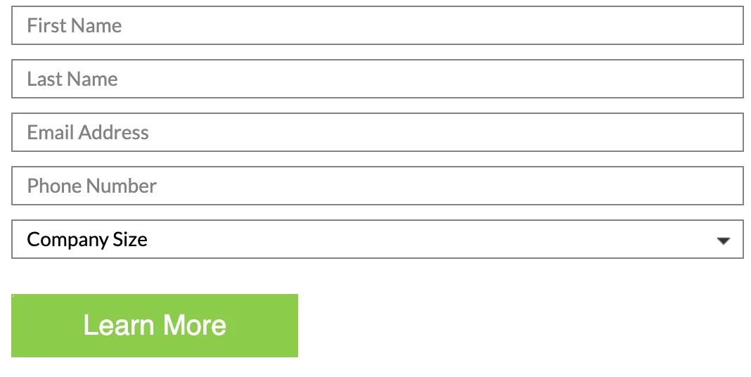
How to change the color of Hint Text/Default Value in "Select" field?
Hi,
I am working on this form. I want to have the color of Select field "Company Size" same as the hint texts above. This shouldn't change the color of dropdown values.
I have tried the following:
option:first-child{
color: #828282 !important;
}
It seemed to overwrite the other CSS, but not acting on screen.
Can anyone please help me out on this?