@jinawatson ,
I've done a bit more work on this.
You have two culprits:
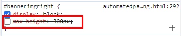
I turned off max-height.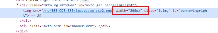
The image width was hard coded to 200px. I deleted that
This gave me the following:

HOWEVER: while it now looks good on desktop, your mobile version does not look good. I think your carousel needs revisiting (didn't the community give some thoughts on this recently?), and you have a huge gap at the top of the image because of all the white space. You need to remove the white space from the image, and in the short term put some padding at the top of the image to align it to the headline. Do this with a CSS class, not an inline style. In your media queries, you can make sure the class that provides the padding get's overridden with a mobile suitable value.
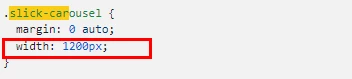
I did dig into the carousel issue. By deleting this CSS element, I resolved the major issue.
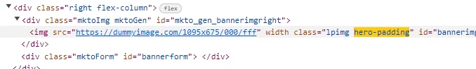
For the image related issue, as a general rule - never bake padding into the image. Crop the image to its correct margins, and do the padding with CSS. I put a dummy image in that was the same size as your hero image would be if it were correctly cropped, and added in the following CSS
.hero-padding { padding-top:150px;
        }
and inside one of the width related media queries:
.hero-padding { padding-top:0px !important;
        }
Then I added the class hero-padding to the styles for the hero image.
That gave a pretty good outcome.
Longer term, you should redesign the template so the header spans the full width and then the left and right columns sit under it, removing the need for extra padding for the hero image in desktop mode.
Currently, the layout is like this:

and it really needs to be this:

Cheers
Jo