
Show/Hide cq-dialog Fields based on Drop-Down Selection in AEM

Show/Hide cq-dialog Fields based on Drop-Down Selection In AEM
by Mayur SatavIn this blog post, we will see how to use OOTB show/hide functionality for CQ-dialogs fields based on the drop-down selection in AEM.In AEM, CQ-dialogs are one of the most important components. It is possible to greatly improve the user experience by strategically hiding dialog fields until a specific option is selected by the user.
It’s time to get started, so let’s do it step by step.
Step 1 — First create one node list of type nt:unstructured for the drop-down list and add below properties.
a. class— cq-dialog-dropdown-showhide*.
b. cq-dialog-dropdown-showhide-target— .{{anyClassName}}-showhide-target*.
e.g.
.test-options-showhide-target
c. fieldLabel— Options Type.
d. name — ./optionsType.
e. sling:resourceType — granite/ui/components/foundation/form/select*.
NOTE — properties marked as * are madatory
Once parent node list is created. Create item node of type nt:unstructured under list node. Then create one node of type nt:unstructured for each drop-down option. List node hierarchy should look like this.
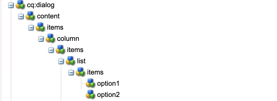
And here we are done with list structure.
You can refer below node structure for Step 1 —
<list
    jcr:primaryType="nt:unstructured"
    sling:resourceType="granite/ui/components/foundation/form/select"
    class="cq-dialog-dropdown-showhide"
    cq-dialog-dropdown-showhide-target=".test-options-showhide-target"
    fieldLabel="Options Type"
    name="./optionsType">
    <items jcr:primaryType="nt:unstructured">
        <option1
            jcr:primaryType="nt:unstructured"
            text="Option1"
            value="option1"/>
        <option2
            jcr:primaryType="nt:unstructured"
            text="Option2"
            value="option2"/>
    </items>
</list>
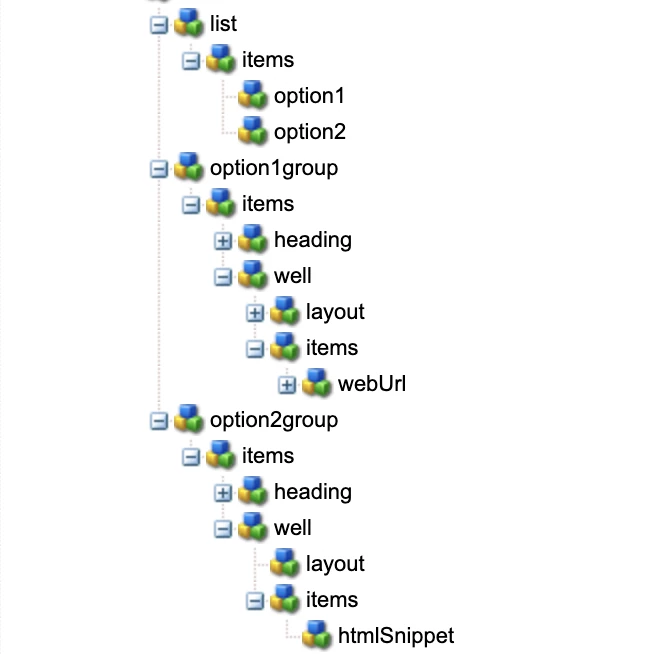
Next, Will create node structure for each drop-down option.
Step 2 — Create container node option1Group of type nt:unstructured and add below properties.
a. class — hide {{anyClassName}}-showhide-target
e.g.
hide test-options-showhide-target
b. showhidetargetvalue — option1
on the basis of showhidetargetvalue, option1Group container will display and hide the fields added under it. showhidetargetvalue value should be same as value given for the option.
c. sling:resourceType — granite/ui/components/foundation/container
till here we are done with main logic of show/hide functionality. Now you can add different fields as per your requirements.
Similarly, follow Step 2 for each drop-down option.
You can refer below node structure for Step 2 —
<option1group
jcr:primaryType="nt:unstructured"
sling:resourceType="granite/ui/components/foundation/container"
class="hide test-options-showhide-target"
showhidetargetvalue="option1">
<items jcr:primaryType="nt:unstructured">
<heading
jcr:primaryType="nt:unstructured"
sling:resourceType="granite/ui/components/foundation/heading"
class="coral-Heading coral-Heading--4"
level="{Long}4"
text="Options 1 Group"/>
<well
jcr:primaryType="nt:unstructured"
sling:resourceType="granite/ui/components/foundation/container">
<layout
jcr:primaryType="nt:unstructured"
sling:resourceType="granite/ui/components/foundation/layouts/well"/>
<items jcr:primaryType="nt:unstructured">
<webUrl
jcr:primaryType="nt:unstructured"
sling:resourceType="granite/ui/components/coral/foundation/form/textfield"
fieldLabel="Web Url"
name="./webUrl"/>
</items>
</well>
</items>
</option1group>
<option2group
jcr:primaryType="nt:unstructured"
sling:resourceType="granite/ui/components/foundation/container"
class="hide test-options-showhide-target foundation-layout-util-vmargin"
showhidetargetvalue="option2">
<items jcr:primaryType="nt:unstructured">
<heading
jcr:primaryType="nt:unstructured"
sling:resourceType="granite/ui/components/foundation/heading"
class="coral-Heading coral-Heading--4"
level="{Long}4"
text="Options 2 Group"/>
<well
jcr:primaryType="nt:unstructured"
sling:resourceType="granite/ui/components/foundation/container">
<layout
jcr:primaryType="nt:unstructured"
sling:resourceType="granite/ui/components/foundation/layouts/well"/>
<items jcr:primaryType="nt:unstructured">
<htmlSnippet
jcr:primaryType="nt:unstructured"
sling:resourceType="granite/ui/components/foundation/form/pathbrowser"
fieldLabel="Upload HTML Snippet"
name="./htmlSnippet"
rootPath="/content/dam/"/>
</items>
</well>
</items>
</option2group>
I am sharing with you complete dialog structure also for your reference.
<?xml version="1.0" encoding="UTF-8"?>
<jcr:root xmlns:sling="http://sling.apache.org/jcr/sling/1.0" xmlns:cq="http://www.day.com/jcr/cq/1.0" xmlns:jcr="http://www.jcp.org/jcr/1.0" xmlns:nt="http://www.jcp.org/jcr/nt/1.0"
    jcr:primaryType="nt:unstructured"
    jcr:title="Test Dialog"
    sling:resourceType="cq/gui/components/authoring/dialog">
    <content
        jcr:primaryType="nt:unstructured"
        sling:resourceType="granite/ui/components/foundation/container">
        <items jcr:primaryType="nt:unstructured">
            <column
                jcr:primaryType="nt:unstructured"
                sling:resourceType="granite/ui/components/foundation/container">
                <items jcr:primaryType="nt:unstructured">
                    <list
                        jcr:primaryType="nt:unstructured"
                        sling:resourceType="granite/ui/components/foundation/form/select"
                        class="cq-dialog-dropdown-showhide"
                        cq-dialog-dropdown-showhide-target=".test-options-showhide-target"
                        fieldLabel="Options Type"
                        name="./optionsType">
                        <items jcr:primaryType="nt:unstructured">
                            <option1
                                jcr:primaryType="nt:unstructured"
                                text="Option1"
                                value="option1"/>
                            <option2
                                jcr:primaryType="nt:unstructured"
                                text="Option2"
                                value="option2"/>
                        </items>
                    </list>
                    <option1group
                        jcr:primaryType="nt:unstructured"
                        sling:resourceType="granite/ui/components/foundation/container"
                        class="hide test-options-showhide-target"
                        showhidetargetvalue="option1">
                        <items jcr:primaryType="nt:unstructured">
                            <heading
                                jcr:primaryType="nt:unstructured"
                                sling:resourceType="granite/ui/components/foundation/heading"
                                class="coral-Heading coral-Heading--4"
                                level="{Long}4"
                                text="Options 1 Group"/>
                            <well
                                jcr:primaryType="nt:unstructured"
                                sling:resourceType="granite/ui/components/foundation/container">
                                <layout
                                    jcr:primaryType="nt:unstructured"
                                    sling:resourceType="granite/ui/components/foundation/layouts/well"/>
                                <items jcr:primaryType="nt:unstructured">
                                    <webUrl
                                        jcr:primaryType="nt:unstructured"
                                        sling:resourceType="granite/ui/components/coral/foundation/form/textfield"
                                        fieldLabel="Web Url"
                                        name="./webUrl"/>
                                </items>
                            </well>
                        </items>
                    </option1group>
                    <option2group
                        jcr:primaryType="nt:unstructured"
                        sling:resourceType="granite/ui/components/foundation/container"
                        class="hide test-options-showhide-target foundation-layout-util-vmargin"
                        showhidetargetvalue="option2">
                        <items jcr:primaryType="nt:unstructured">
                            <heading
                                jcr:primaryType="nt:unstructured"
                                sling:resourceType="granite/ui/components/foundation/heading"
                                class="coral-Heading coral-Heading--4"
                                level="{Long}4"
                                text="Options 2 Group"/>
                            <well
                                jcr:primaryType="nt:unstructured"
                                sling:resourceType="granite/ui/components/foundation/container">
                                <layout
                                    jcr:primaryType="nt:unstructured"
                                    sling:resourceType="granite/ui/components/foundation/layouts/well"/>
                                <items jcr:primaryType="nt:unstructured">
                                    <htmlSnippet
                                        jcr:primaryType="nt:unstructured"
                                        sling:resourceType="granite/ui/components/foundation/form/pathbrowser"
                                        fieldLabel="Upload HTML Snippet"
                                        name="./htmlSnippet"
                                        rootPath="/content/dam/"/>
                                </items>
                            </well>
                        </items>
                    </option2group>
                </items>
            </column>
        </items>
    </content>
</jcr:root>
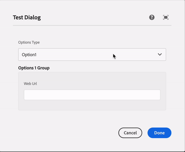
Output
Summary
Basically, class and cq-dialog-dropdown-showhide-target these both properties are mandatory for hiding container based on showhidetargetvalue property value.
In short —
- add class — cq-dialog-dropdown-showhide and cq-dialog-dropdown-showhide-target — .{anyName}-showhide-target in your dropdown list node
- Add class — hide {anyName}-showhide-target and showhidetargetvalue — { value of drop down option } in each container of your drop-down list option.
Q&A
Please use this thread to ask questions relating to this article