Show/Hide core component dialog | Community
Skip to main content
Level 2
October 3, 2025
Question

Show/Hide core component dialog

  • October 3, 2025
  • 1 reply
  • 305 views

Hi Experts,

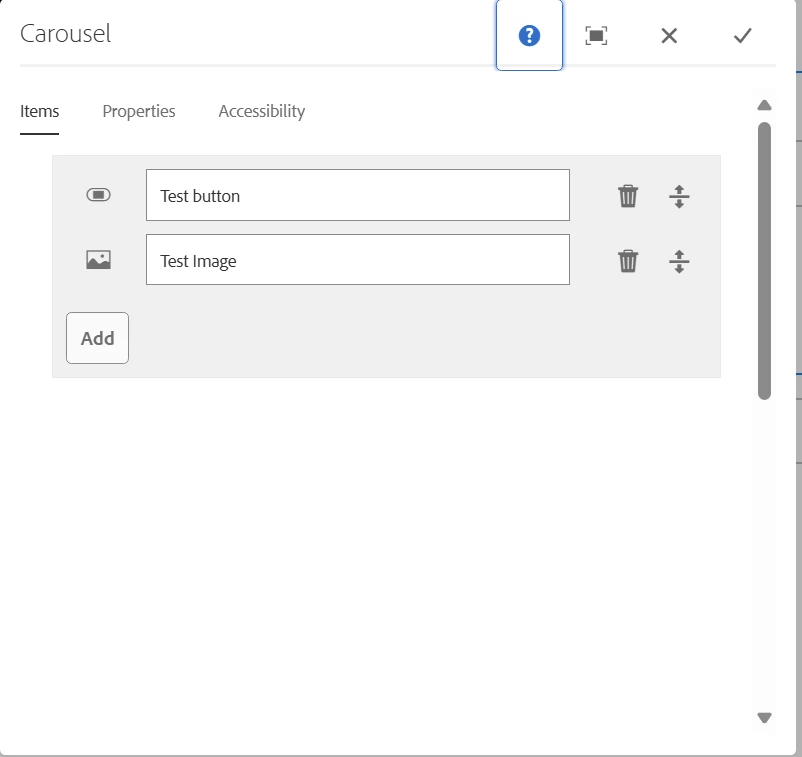
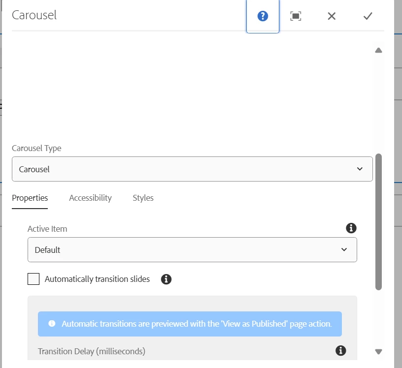
I am using v1/carousel core component as extending resourceSuperType in my .xml. I want to show hide the entire dialog of the component using show/hide dropdown functionality, as if i select core i need to show all the core dialog and if i select 'custom', i need to show custom dialog. I am having dialog config in cq_dialog and show hide using granite:class but the issue is the core dialog tabs are showing on top of my dropdown selection and if i select my drop down it displays the dialog again below. How to achieve the show/hide properly.


1 reply

SantoshSai
Community Advisor
Community Advisor
October 3, 2025

Hi @prasanth_s,

1. Use Two Separate Dialogs and a Wrapper Dropdown

  • Define two dialogs (one for Core, one for Custom).

  • In your cq:dialog, keep only the dropdown (selector).

  • Use granite:rendercondition to include the correct sub-dialog based on dropdown selection.

Example structure:

<cq:dialog jcr:primaryType="nt:unstructured" xmlns:cq="http://www.day.com/jcr/cq/1.0" xmlns:sling="http://sling.apache.org/jcr/sling/1.0" xmlns:jcr="http://www.jcp.org/jcr/1.0"> <content jcr:primaryType="nt:unstructured" sling:resourceType="granite/ui/components/coral/foundation/container"> <items jcr:primaryType="nt:unstructured"> <!-- Dropdown Selector --> <dialogType sling:resourceType="granite/ui/components/coral/foundation/form/select" fieldLabel="Dialog Type" name="./dialogType"> <items jcr:primaryType="nt:unstructured"> <core jcr:primaryType="nt:unstructured" text="Core" value="core"/> <custom jcr:primaryType="nt:unstructured" text="Custom" value="custom"/> </items> </dialogType> <!-- Core Dialog Tabs --> <coreDialog sling:resourceType="myproject/components/coreDialog" granite:class="dialog-core" granite:rendercondition="myproject/components/renderconditions/isCoreSelected"/> <!-- Custom Dialog Tabs --> <customDialog sling:resourceType="myproject/components/customDialog" granite:class="dialog-custom" granite:rendercondition="myproject/components/renderconditions/isCustomSelected"/> </items> </content> </cq:dialog>

Here, isCoreSelected / isCustomSelected are small rendercondition servlets (can be written in HTL/JavaScript/Java) that check the saved dropdown value and decide which dialog to render.

2. Overlay Core Dialog + Use Tabs Show/Hide

  • Instead of swapping dialogs, overlay the core cq:dialog.

  • Add a dropdown in the first tab.

  • Assign a Granite class like showhide and use data-showhidetarget to toggle core vs custom tabs.

Example:

<dialogType sling:resourceType="granite/ui/components/coral/foundation/form/select" fieldLabel="Dialog Type" name="./dialogType" granite:class="cq-dialog-dropdown-showhide" cq-dialog-dropdown-showhide-target=".dialog-switch"> <items> <core text="Core" value="core"/> <custom text="Custom" value="custom"/> </items> </dialogType> <coreTab jcr:primaryType="nt:unstructured" jcr:title="Core Properties" granite:class="dialog-switch dialog-core"> ... </coreTab> <customTab jcr:primaryType="nt:unstructured" jcr:title="Custom Properties" granite:class="dialog-switch dialog-custom"> ... </customTab>

Then add some clientlib JS to hide/show based on selection.

3. Simpler Alternative (if business allows)

Instead of switching entire dialogs:

  • Keep the Core dialog as-is.

  • Add an extra Custom tab (hidden by default).

  • Toggle visibility of that tab based on dropdown.
    This avoids fighting with AEM’s dialog inheritance and is usually the smoothest.

Santosh Sai
Level 2
October 12, 2025

Hi @santoshsai , Thanks for your valuable suggestion, as of now i finalized going with the below approach where i am using custom tab and overlaying core tabs and show hide based on dropdown select, which hides the tab items upon selection.


<content
jcr:primaryType="nt:unstructured"
sling:resourceType="granite/ui/components/coral/foundation/tabs">
<items jcr:primaryType="nt:unstructured">
<variant
jcr:primaryType="nt:unstructured"
jcr:title="Variant"
sling:resourceType="granite/ui/components/coral/foundation/container"
granite:relativePosition="before"
margin="{Boolean}true">
<items jcr:primaryType="nt:unstructured">
<carouselType
jcr:primaryType="nt:unstructured"
sling:resourceType="granite/ui/components/coral/foundation/form/select"
fieldLabel="Carousel Type"
name="./carouselType"
value="carousel"
granite:class="cq-dialog-dropdown-showhide">
<granite:data
jcr:primaryType="nt:unstructured"
cq-dialog-dropdown-showhide-target=".select-showhide-target" />
<items jcr:primaryType="nt:unstructured">
<carousel
jcr:primaryType="nt:unstructured"
text="Carousel"
value="carousel"/>
<custom
jcr:primaryType="nt:unstructured"
text="Custom Carousel"
value="custom"/>
</items>
</carouselType>
</items>
</variant>
<customCarousel
jcr:primaryType="nt:unstructured"
granite:class="hide select-showhide-target">
<granite:data
jcr:primaryType="nt:unstructured"
showhidetargetvalue="custom" />
<items jcr:primaryType="nt:unstructured">
<title
jcr:primaryType="nt:unstructured"
sling:resourceType="granite/ui/components/coral/foundation/form/textfield"
fieldLabel="Title"
name="./title"/>
</items>
</featuredCarousel>
<tabs
jcr:primaryType="nt:unstructured"
jcr:title="Carousel"
sling:resourceSuperType="core/wcm/components/carousel/v1/carousel/cq:dialog/content/items/tabs"
granite:class="hide select-showhide-target">
<granite:data
jcr:primaryType="nt:unstructured"
showhidetargetvalue="carousel" />
</tabs>
</items>
</content>


Thanks