

What your Dynamic Media assets do after they leave the DAM
I am from AEM Dynamic Media team and I help customers get more measurable value from Dynamic Media: faster experiences, assets that work harder across channels, and a clearer view of what happens after content goes live. One simple self-service report has become especially useful in those conversations. It is the Dynamic Media delivery report. If you use AEM as a Cloud Service with a Dynamic Media license, you can generate and download the report yourself.
The visibility gap of asset activation
We often hear customers say that once an asset leaves the DAM, visibility becomes fragmented. We know what we created and published, but we do not always know which assets are receiving the most delivery, which channels are consuming them, or how that consumption varies across markets. The Dynamic Media delivery report helps reconnect that last mile.
To keep this conversation practical, I stepped into the shoes of a growth marketer at a fictional fashion retailer, “Luma Retail”. I used one month of illustrative delivery data and analyzed it with Claude- you can use your choice of analytics tool to get the best out of the data. Here is a link to the illustrative delivery data, feel free to glance it before reading further:
https://docs.google.com/spreadsheets/d/1JIyg7YsvfrNVF3FbQi5LPPm2oKvg3RfkiPRQQ6zFHEw/edit?usp=sharing
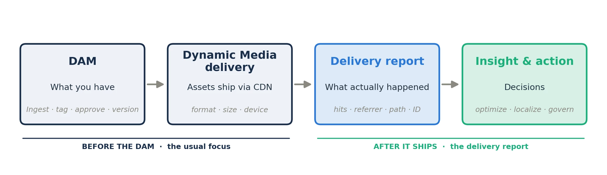
Figure 1: The delivery report covers the part of the asset lifecycle that begins after publication.
Five columns and the hidden insights
The report contains five fields:
- Name
- Path
- Dynamic Media ID
- Referrer
- Hits
After sorting, grouping, and comparing those five columns, a richer picture began to emerge. In the illustrative Luma dataset, assets generated roughly one billion requests in one month. About 70% came from web experiences and 30% from email. The email number caught my attention. Three hundred million requests is not a small supporting channel, and Apple Mail alone represented about 15% of the overall delivery footprint.
The report also offered a view of where web delivery was originating, based on the referrer domain. The United States represented the largest share, followed by meaningful activity across the United Kingdom, Germany, Japan, Canada, Mexico and Saudi Arabia.
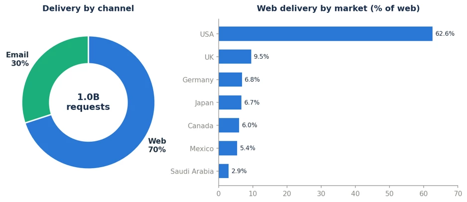
Figure 2: Illustrative channel and market distribution inferred from referrer data.
Five things the report helped me see
1. I can quickly identify my top-delivered assets
The simplest place to start is the top of the list. Ranking assets by Hits shows which files are receiving the most delivery. I can take that short list into conversations with engineering, campaign teams, or content owners and begin asking better questions:
- Is this level of traffic expected?
- Are these assets optimized with Smart imaging or Adaptive streaming?
- Are there delivery patterns that deserve further investigation?
That makes this one of the most useful starting points in the analysis of content activation.
2. The same creative activates differently across markets
This was the insight I found most valuable. When I looked at the country associated with each referrer, I could see that the same campaign was not being consumed uniformly across markets.
The illustrative data showed distinct patterns:
- SS26 Coastal Edit was strongly led by the United States.
- City Layers had a stronger share in Germany.
- Cashmere Edit leaned toward the United Kingdom.
- New Arrivals had a stronger share in Japan.
- Denim Refresh leaned heavily toward Mexico.
- Canada contributed to the broader international mix.
For a marketer, this is a compelling starting point for cross-market activation.
The view can help reveal:
- Where a campaign is already finding an audience
- Where localization may deserve a closer look
- Where a regional team may want to increase activation
- Where a creative treatment is performing differently from the global pattern
- Which campaign and market combinations deserve deeper analysis
It does not tell me why a campaign has a stronger share in one market. It also does not prove that the campaign is commercially successful there. What it does give me is a signal. That signal is enough to start a useful conversation with regional marketing teams about localization, activation, creative relevance, and follow-up analysis.
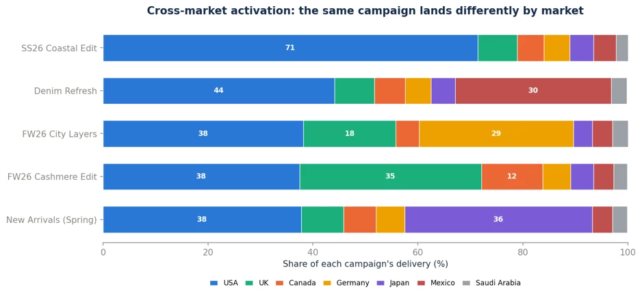
Because the market is inferred from referrer data, I would treat this as directional rather than exact. Even with that caveat, it gives regional and campaign teams something concrete to discuss:
Where is the creative already finding an audience? Where might localization help? Which market deserves a deeper look?
Cleaner and more consistent referrer data makes that conversation sharper.
3. Email was bigger than I had treated it
The report also changed how I thought about email. In the illustrative data, email represented about 30% of delivery, with Apple Mail accounting for approximately 15% of the overall footprint. Insights it brings for me: how significant email was within Luma’s content-delivery footprint and which clients shaped that footprint. That is enough to influence action. If email carries this much delivery activity, creative quality, image weight, and client-specific QA deserve the same discipline that we bring to the website.
4. Video was more than a bandwidth line item
The hero video and product-page video together represented approximately 100 million requests, or about 10% of delivery in the illustrative dataset. I would not call that a conversion metric. But because the product video appears close to the point of purchase, its delivery becomes a useful signal to examine alongside experience and commerce analytics. Questions I can begin to ask:
- Where is the video being delivered?
- Which experience is driving that delivery?
- Is the delivery pattern consistent with the intended customer journey?
- What do the surrounding engagement and commerce metrics show?
The delivery report does not answer all these questions, but it tells me where further investigation may be worthwhile.
5. File names became a useful demand signal
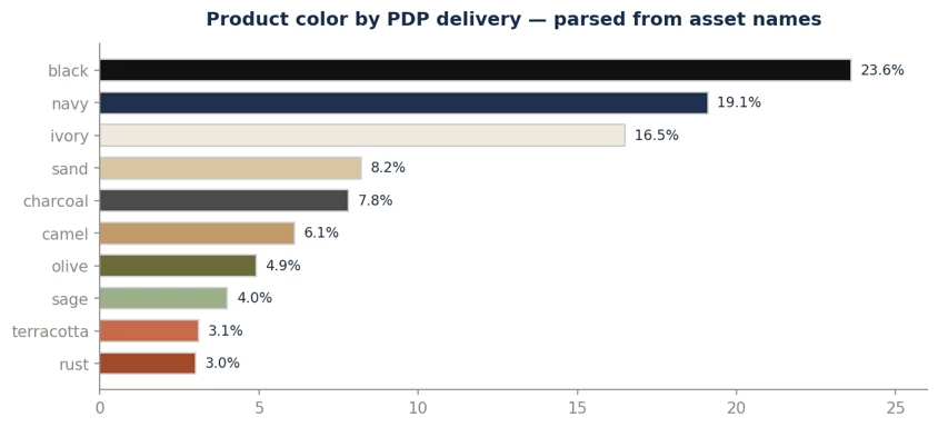
This was another discovery I did not expect. The report does not contain sales data, CRM data, or customer profiles. But because the asset names included product attributes, I could group product-image delivery by characteristics such as color and department.
In the illustrative data:
- Black represented 24% of product-page image requests.
- Navy represented 19%.
- Ivory represented 16%.
- Together, those three colors accounted for about 59%.
- Womenswear represented approximately 49%.
I would never present this as sales demand. It is better treated as a quick, directional signal of what customers are looking at. That signal can tell a marketer where to investigate further, and it is available as soon as the report lands. This is where the delivery report began to feel less like an operational report and more like a marketing tool. And it worked because the file names carried meaningful information.
The real unlock was not only the report. It was the naming.
Most of the analysis above would not have been possible with file names such as:
IMG_4471_final_v2.jpghero_banner_new.pngemail3.jpg
Those names may help someone recognize a file during production, but they carry very little context into delivery data. Compare them with:
luma-womens-linen-blend-midi-dress-sand-pdp-front.jpegluma-ss26-coastal-edit-hero-desktop.jpegluma-2026-08-cashmere-edit-email-header.jpg
The second set tells a story. Each name identifies useful details such as the brand, department, product, campaign, season, channel, placement, or asset role. Every token can become a filter.
Every descriptive term can become a clue.
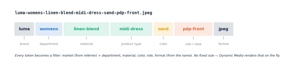
Figure 5: A practical naming pattern that moves from general to specific, using lowercase and hyphens.
But should metadata not handle this?
Yes, metadata matters the most. Rich schemas, product-information feeds, governance, and AI-generated tags should carry deeper business context inside a modern DAM. At present the reporting tool does not bring the full metadata model into the CSV. For this particular report, the file name and folder path are the descriptive dimensions that remain visible in delivery data.
I would not choose naming instead of metadata. I would use both:
- Metadata for internal richness, search, governance, integration, and automation
- Structured names and paths for readable delivery data and image SEO - here is a best practice recommendation from Adobe.
I would also avoid making naming a manual burden. Wherever possible, apply the convention upstream through ingestion rules, processing profiles, or product-information-driven naming.
Try it with one month of your own data
If you use Dynamic Media on Cloud Services, you can start now. In AEM Assets view, generate the Dynamic Media delivery report, download one month of data and analyze it in your tool of choice.
Final thoughts
The DAM tells you what you have. The delivery report helps you understand what happened after those assets went live: which assets receive the most delivery, which channels and markets consume them, and what patterns deserve a closer look. For me, the cross-market view is especially useful. Seeing the same campaign activate differently across the United States, United Kingdom, Mexico, Canada, Japan, and Germany creates a practical bridge between asset delivery and regional marketing conversations. It does not replace campaign, engagement, or commerce analytics. It gives teams another signal to use alongside them. The report becomes even more useful when asset names and paths carry meaningful context. Pull a month, ask a few questions, and see what your assets can tell you once they leave the DAM.