Using CJA workspace as a 'report' | Community
Skip to main content
Level 2
May 2, 2025
Solved

Using CJA workspace as a 'report'

  • May 2, 2025
  • 2 replies
  • 454 views

Hello


We'd like to give some report-like workspace views to users ... that are very simple... much like reports available in Tableau.... and we don't want to go through the hassle of connecting Tableau to Dataviews.


Does anyone have experience in creating simple dataviews and workspaces that are the equivalent of Tableau reports????


thanks


Best answer by Jennifer_Dungan

Can you be a little more specific about what you mean when you say "like a Tableau Report"?


You can do a lot with Workspaces, you can make your Panel have dropdown segments allowing people to see different combinations of data, you can have "dynamic dropdowns" based on dimensions that populate based on other drop down selections....


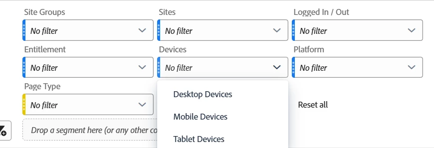
Most of my reports have a standard set of drop downs like Site Group, Site, Logged In Status, Entitlement Status, Device Type, and Platform.... this particular report has an added dynamic "Page Type" drop down so that people can drill down into very specific sets of data.


2 replies

Jennifer_Dungan
Community Advisor and Adobe Champion
Jennifer_DunganCommunity Advisor and Adobe ChampionAccepted solution
Community Advisor and Adobe Champion
May 2, 2025

Can you be a little more specific about what you mean when you say "like a Tableau Report"?


You can do a lot with Workspaces, you can make your Panel have dropdown segments allowing people to see different combinations of data, you can have "dynamic dropdowns" based on dimensions that populate based on other drop down selections....


Most of my reports have a standard set of drop downs like Site Group, Site, Logged In Status, Entitlement Status, Device Type, and Platform.... this particular report has an added dynamic "Page Type" drop down so that people can drill down into very specific sets of data.


MandyGeorge
Community Advisor and Adobe Champion
May 2, 2025

In addition to the features Jen mentioned, there's also a number of visualizations you can use. Summary numbers or summary change both work like cards that can give you large numbers at the top of your dashboard (or anywhere you want). You can resize and move them around to give it the visual appearance you want. 

There's also visualizations like line graphs, bar charts, etc that let you display your data visually. If you create a table and then build a visualization off of it, you do also have the option to hide the source table to make it look a bit cleaner.


If you can explain a bit more about what you want we can give you some more specific examples of how to build out workspace to look like that. But there are a lot of options that you can play around with to build different types of visualizations to make it look like a report.