AEM: Customize emulators in layout mode | AEM Community Blog Seeding

AEM: Customize emulators in layout mode by Theo Pendle
Abstract
As a developer I have a confession to make: I don’t actually care about real device dimensions, I’m only concerned about @media() queries… #sorrynotsorry. So Iwas pleasantly surprised when AEM authors came to tell me that they didn’t either.

If you’ve ever used the AEM Page Editor and the Layout mode, you’ll be familiar with the default breakpoints and emulators offered OOTB by AEM

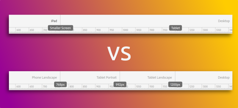
The problem with these default settings is that they require an author to use multiple emulators in multiple orientations in order to reach every breakpoint. For example in the image above, how do you test the Tablet breakpoint? The iPad is too small and the Desktop is too large.
Well you have to click on the Device Rotation button (in red) to get the iPad in Landscape orientation and then click the button again when you’re done to go back to Portrait orientation.
Read Full Blog
AEM: Customize emulators in layout mode
Q&A
Please use this thread to ask the related questions.

