
Make Date Annotations more visual within our graphs
Description -
It's great that Adobe added data visualizations to our graphs a few years ago, but the way they display isn't very visually impactful...
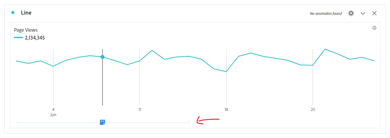
It's a little flag that shows in the X-Axis, leaving the users to still try to identify where exactly that point lies on the graph.
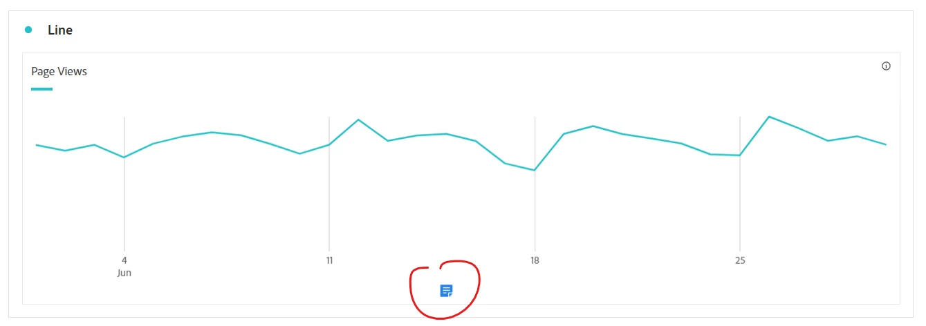
Of course, users can hover to have a line show up for the annotation.. but that doesn't really work for PDFs.. and if there are a series of annotations you can only see one at a time... let's say you are reviewing the impact of a multi-site migration rollout, you might want to see each point where sites were migrated and the impact over time of all the sites together...
Having the ability to show a permanent visual indicator would allow everyone to see at a glance where the impacts are, and users can still check the annotation details one at a time.
Why is this feature important to you -
Making the annotations more visible at a glance, and being able to see multiple annotation markers at once allows the data to be ingested by users easier.
How would you like the feature to work -
This could be an optional checkbox to show or not show the intersections all the time.. as I know that if there are a large number of annotations this could get busy and make the visuals overwhelming.. but for a few annotations this would be a handy visual to have.
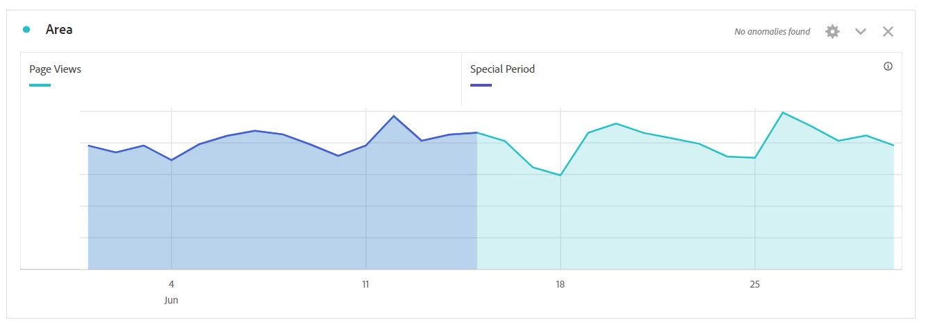
Right now, in order to have a visual representation, I have to create a custom date/date range, a segment from that custom date, a calculated metric using that segment in an IF statement, and then graph my metric and calculated metric as an area chart:
If we could get a more visual annotation out-of-the-box it would save a lot of time, and I think be beneficial to all.
Current Behaviour -
It's just a flag that when you hover shows a vertical for individual dates, or a mid-point vertical and an extremely pale range line for date ranges:
When it comes to ranges, the user has to use their best judgement trying to understand where on the line the range actually starts/stops because the indicator is separate from the actual data... they can see "in general" where the range is, but don't have the detailed specifics of the intersection.