February 2, 2018
Question

Buttons showing two colors on Marketo email template

  • February 2, 2018
  • 3 replies
  • 4909 views

Hi There,

I've created an email using the "Carnival" template, and when I created the email and view it in Marketo as a web page it looks great. When I send a sample to my outlook email, the buttons have a pink underlay and the date (which is in a circle shape) turns to a square.  Is this something I can fix within the HTML code? I've also noticed that it's not appearing mobile responsive. See below:

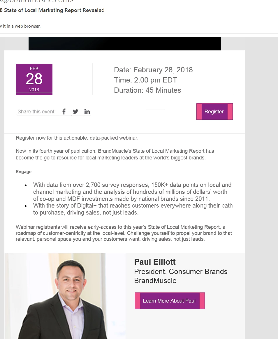
and when I created the email and view it in Marketo or on a web browser, everything is great. When I view it in my outlook inbox, the buttons have a pink underlay, the header image is not fully rendering, and the date icon turns into a square as opposed to a circle. We’re hoping it’s something in the HTML code that we can quickly fix but are hoping with your Marketo knowledge you can help us out, as this is deploying Monday. Let me know what you need from me to take a look, I think Lori gave you Marketo credentials as an admin, so you can find this email template under Marketing Activities, Events, 2018 State of Local Marketing Webinar, Step 1 Email Prospects.

This post is no longer active and is closed to new replies. Need help? Start a new post to ask your question.

3 replies

SanfordWhiteman
Level 10
February 2, 2018

You'd have to post the HTML/CSS you're using to create that button.

And use the syntax highlighter in the Advanced Editor when posting that code:

Dan_Stevens_
Level 10
February 2, 2018

The other thing I just noticed in your screenshot - that we're also experiencing with our custom template in Outlook - is this faint white line:

We too are experiencing this with our custom template in Outlook.  The white line appears in our call-to-action buttons (which are using custom CSS for rounded corners that Outlook does not support).  This line only appears for some users.  I'm able to reproduce on my end by adjusting my "zoom" level in the lower right of the preview window.

Here's how our CTA buttons are supposed to look (and how they look in all email clients/mobile, except for some Outlook users):

But here's how they look for some users in Outlook (again, the rounded corners will not appear in Outlook):

I bet that purple circle with the date is also using rounded corners - which Outlook doesn't support - to achieve the circle shape (it's actually using the "border-radius" property).  Which we can accept.  It's this thin white line - and so far, we haven't been able to diagnose the cause.  Here's the CSS for the buttons:

<td valign="top" class="padding_bottom" style="text-align:center;">

<div class="mktoText" id="Two-col-cta2" mktoname="CTA">

<table align="center" border="0" cellpadding="0" cellspacing="0" style="margin: 0 auto;">

<tbody>

<tr>

<td style="background-color: ${Two-col-CTA-Bgcolor}; font-family: 'Segoe UI',  Arial, 'Helvetica Neue', sans-serif; font-size: ${Two-col-CTA-font-size}; mso-line-height-rule: exactly; line-height: ${Two-col-CTA-line-height}; text-align: center; vertical-align: middle; color: ${Two-col-CTA-color}; text-transform: uppercase; display: block; padding: ${Two-col-CTA-padding} 24px;letter-spacing: 2px; border-radius: 5px;" valign="middle"><a class="button" style="text-decoration:

none;

color: ${Two-col-CTA-color} !important; font-family: 'Segoe UI',  Arial, 'Helvetica Neue', sans-serif; font-size: ${Two-col-CTA-font-size}; line-height: ${Two-col-CTA-line-height}; outline: none;" href="${Two-col-CTA-url}"><span style="color:${Two-col-CTA-color};">${Two-col-CTA-Text}</span></a></td>

</tr>

</tbody>

</table>

</div>

</td>

Dave_Roberts
Level 10
February 3, 2018

Hey Dan-

It looks like there is a white border getting rendered around the <a> element. I dont see that in the code here, but it might be in the .button class in the CSS in the <head>?

It might help to set an inline 'override' on the <a> element in the style section... something like

<a style="border:0px !important; text-decoration:none;color: ${Two-col-CTA-color} !important; font-family: 'Segoe UI',  Arial, 'Helvetica Neue', sans-serif; font-size: ${Two-col-CTA-font-size}; line-height: ${Two-col-CTA-line-height}; outline: none;">

I think what's happening here is that Outlook is reading the <a> element as shorter than the <td> and is drawing a border around the <a> which is normally the same height as the <td> so it wouldn't be noticable. You might also try setting the border-color to either match or "transparent" and see if that helps it blend, but that'd really just "cover up" the difference instead of resolve it.

I also wanted to ask b/c I've had some 'surprising' experiences with the EM editor -- does your editor ever crash while you're editing modules that have variables inside the Editable areas? I noticed that this was making my design studio editor session crash or lockup and I'd need to reload the page to (hopefully) continue editing. I've gotten away from using variables inside the editable areas since so wanted to know if maybe that was just me or if it's happening for other people too?

Thanks Dan, and I hope this helps, let me know how it goes.

-Dave

Dan_Stevens_
Level 10
February 3, 2018

Hi Dave - thanks for offering up a potential solution here.  Unfortunately, that didn't do the trick.  It's so odd how it just introduces this line/border under certain zoom levels.  You can clearly see that some sort of border is being introduced at these zoom levels (by highlighting the button with a mouse - here are examples in Outlook and then viewing the email code in Chrome):

Outlook:

Chrome:

BTW, the .button class only contains this code:

.button{color:#ffffff !important;text-decoration:none;}

Regarding your question around the editor itself (especially since most of our modules include variables) - yes, the editor either crashes, becomes completely unresponsive and/or messes with the layout - especially given the complexity of this "all-in-one" template.  Usually, a browser refresh solves it, but annoying nonetheless.  Here's an example of our extensive use of variables in just one of the modules:

Dave_Roberts
Level 10
February 3, 2018

Hey Christina-

I had a look at the code for the Carnival template and noticed that when I changed the button color to Marketo Purple (#5A54A4), I was still seeing the pink color in the HTML (#ed4e89) - set as the background-color. I think this is why you're seeing two different colors. It should probably get fixed in the Template Gallery, but for now, it looks like you'll need something a little faster than that so I opened up the HTML for the template to have a look and try and offer a solution you could put into place.

If you go in to edit the code for the Carnival template, this turns out to be an easy fix. If you've modified the template, this might not be on line 1675, but you can search for ${new1ButtonBackgroundColor2} to find it in the code.

All that you'll need to do to update the buttons is copy/paste the variable in place of the #ed4e89 -- the end product should look like

...; background-color: ${news1ButtonBackgroundColor2};"

this will turn whatever is pink to purple (or whatever color you set with the editor). Unfortunately, it looks like this might need to get applied to more than just the one button, but I'd at least hit the pink/purple ones for now.

---

I can't be sure about the white lines without taking the code into something like Litmus to tinker with it, but that's usually caused by "over-doing it" in an email. In short, I've seen this when Outlook thinks a section is one size and the rest of the civilized world agrees it is clearly bigger than that. It's a subtle thing, but I've also found that Outlook seems to prefer the "longhand" notation of borders (i.e. border-left-width:__px; border-left-style:____; border-left-color:____;... vs border: 1px solid #000;). Most of the other email clients will 'interpret' this, but Outlook seems to have preferences in the matter. This is also true of line-height, which Outlook like to interpret at "height" and that is usually the biggest culprit of issue with image/button display (nested elements) in Outlook. I've also seen combinations of display:inline-block and display:block make things wonky in Outlook, so those might be a few things to look at.

I also thought it'd be worth mentioning the nested variables in the code Dan attached - it's something that I've run into so many issues with the editor that I don't use anymore. I've crashed the editor more than once by modifying a module that's got a variable inside of an editable area. Basically, if you can see the variables in the email, you can anticipate some kind of crash when you're editing it (that's been my experience, maybe it's gotten better but I avoid this practice now). Aside from the headache of a frozen screen and a reload, using variable as the link URL will prevent them from translating into the text-only version. If you're using buttons w/ variables for the text/links, make sure you're double checking the text-only version and updating that with the link info if that's important to relay to your audience.

I hope this helps you get something in play in time! Let me know if I can help you any more specifically with anything here.

-Dave