
quarkmage
Level 3
August 12, 2026
Question

Report looks different when opened as a report vs presented in a dashboard - why?

  • August 12, 2026
  • 2 replies
  • 130 views

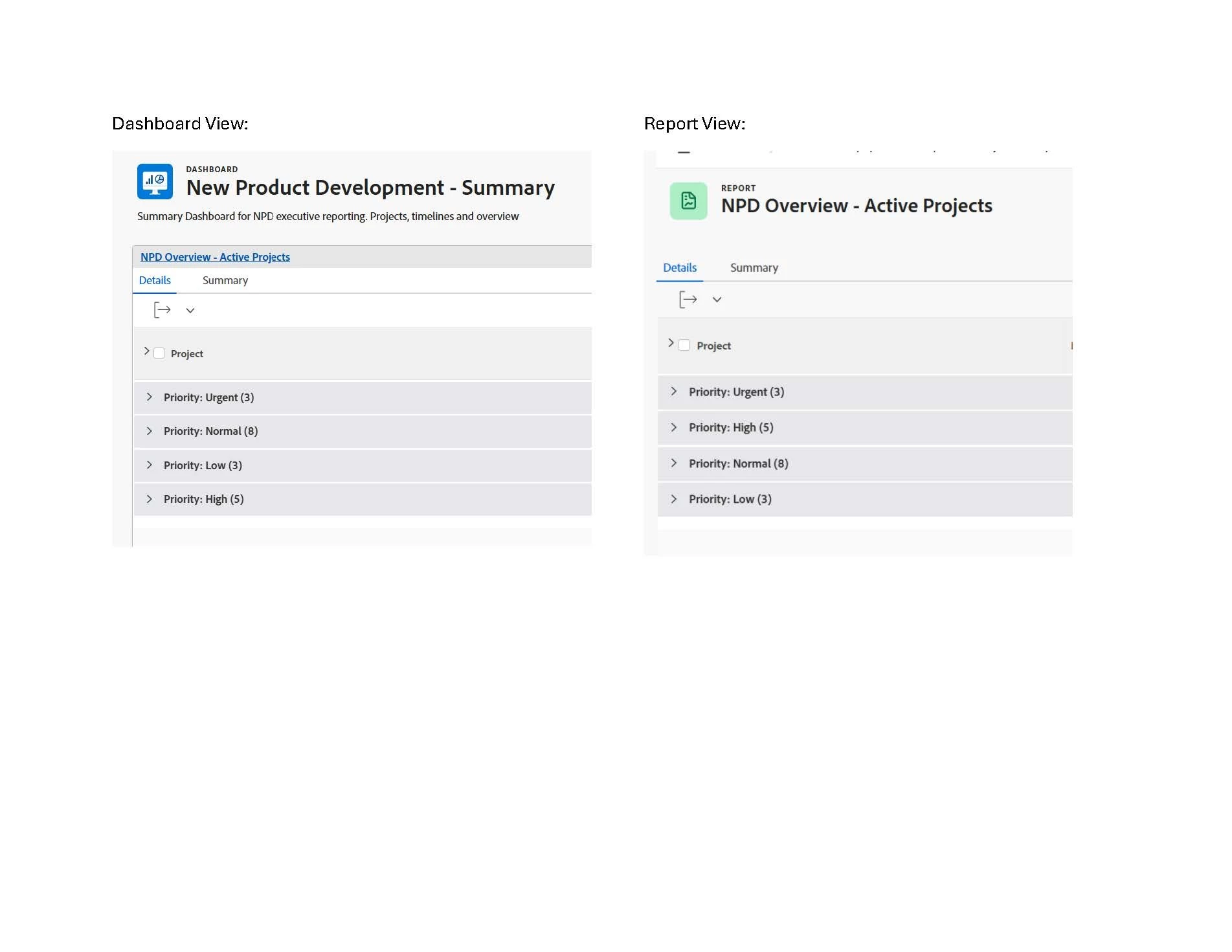
When a specific report is loaded as a part of the dashboard it has different sorting compared to when i access the report directly. In particular, when loaded from dashboard, sorting by priority, descending creates this order: urgent, normal, low, high.

When i click on the report from the dashboard, and just the single report loads i get the expected order: urgent, high, normal, low.

i have tried removing report from dashboard, then adding again, creating a copy of the report, multiple report edits…
Not sure why the display on the dashboard view is different.
Thanks for the help.


    2 replies

    skyehansen
    Adobe Champion and Community Advisor
    August 13, 2026

    you mentioned you created a copy of the report, but you didn’t mention if you had tried to create a second report by hand. I would first just create a simple project report and only add the priority field, sort, and grouping. If this one doesn’t go into the dashboard well, you should submit a case for Support to take a look. I did a simple proj report and it looks just the same in the dashboard as it does outside the dashboard.

    Level 2
    August 25, 2026

    The screenshots don’t show the columns of the report, but is the priority column which determines the order marked as “Show this column when on a Dashboard”?