
Ryan_Worden1
Level 2
May 21, 2015
Respondido

Email program dashboard percentages

  • May 21, 2015
  • 2 comentários
  • 1875 Visualizações

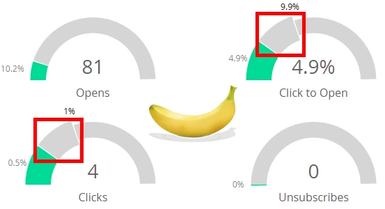
Could someone please tell me what the "additional percentage space"(for lack of a better descriptor) is? I understand that the colored space shows your actual percentages, but I am confused about the additional section. (Banana for scale)
Thanks,

Ryan

Este tópico foi fechado para respostas.
Melhor resposta por

When the numbers are really small, it zooms in so you can see better. That top section shows you the total scale. For example, it's showing you that your four clicks are 0.5% and that's half of the zoomed in portion, which shows you only 1% of the chart,

2 comentários

Resposta
May 21, 2015

When the numbers are really small, it zooms in so you can see better. That top section shows you the total scale. For example, it's showing you that your four clicks are 0.5% and that's half of the zoomed in portion, which shows you only 1% of the chart,

Ryan_Worden1
Level 2
May 21, 2015

Makes complete sense, thanks for answering! We had a lot of guesses flying around the office, anything from a "projected percentage" to a "benchmark standard percentage" - so thanks for the clarification.

Cheers,

Ryan