Question
Want less space between tree items in the new design? Read on...
Like many of you, I'm "getting used to" the new Marketo layout. My biggest gripe is that there is low information density in the new design; we are used to seeing much more on the screen than we currently do.
If you would like your tree to look like this, then read on: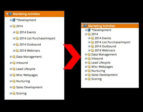
These instructions are for Google Chrome. There is probably a similar extension for Firefox as well. NOTE: Marketo may change their DOM at any time, so this could stop working...and could also have unintended results. Use with caution, and I accept no responsibility for any damage/issues/etc.
- Download the Stylebot extension for Google Chrome.
- When you log in to Marketo and are on the dashboard, click the Stylebot icon (see image here) and click "Open Stylebot"
- At the bottom of the window, click "Edit CSS" and then paste the following code:
.mkt-carbolt .x-tree-node .x-tree-node-el {
padding: 0;
}
And voila! This will remove the spacing between the tree items and let you get more info on your screen at once. If you want a little bit of space, try putting 1px or 2px instead of 0 in the code above.
Marketo, please make this an option and give us our ability to see our stuff back 🙂
And voila! This will remove the spacing between the tree items and let you get more info on your screen at once. If you want a little bit of space, try putting 1px or 2px instead of 0 in the code above.
Marketo, please make this an option and give us our ability to see our stuff back 🙂