Solved
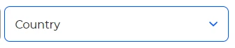
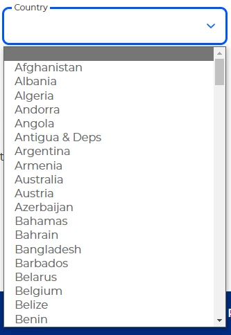
Styling the dropdown field
Hello everyone,
Our forms are being embedded on our page. Now we are wanting to change the style of the marketo dropdown field to follow out Brand design scheme. We have partially been successful, as we were able to change the field. The issue that we are facing right now is when the dropdown field is in an open state, the container around the <option> tags look different. We have tried many ways to change this, is there any suggestions how to tackle this issue?
Below are images viewed on a desktop and on Edge: