Reports in Email Send Dashboard | Community
Skip to main content
Level 1
March 13, 2026
Question

Reports in Email Send Dashboard

  • March 13, 2026
  • 1 reply
  • 16 views

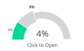
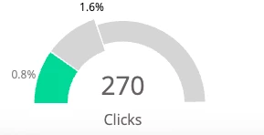
Can anyone tell me what the 8% metric in the gray area of the CTO graphic is measuring? Same with the 1.6% gray area in the Clicks graphic.


1 reply

Darshil_Shah1
Community Advisor and Adobe Champion
March 13, 2026

It’s just because the green percentage in your example is relatively small, so the dashboard zooms in on that portion of the graph to make it easier to see visually. The second numbers (8% and 1.6%) are simply there to provide scale for the chart. It's also mentioned in the documentation page: https://experienceleague.adobe.com/en/docs/marketo/using/product-docs/email-marketing/email-programs/email-program-data/use-the-email-program-dashboard#UsetheEmailProgramDashboard-Summary-Engagement


bmcintareAuthor
Level 1
March 13, 2026

Thank you! That’s helpful. I’ve looked at that documentation page several times and missed that note every time.