Problem with making forms & form button responsive | Community
Skip to main content
March 11, 2016
Question

Problem with making forms & form button responsive

  • March 11, 2016
  • 1 reply
  • 1043 views

Hi all,

Would really appreciate some advice on this, I have uploaded a bootstap landing page to Marketo, and embedded a Marketo form within it.

I am having two problems,

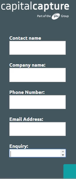
1) I am struggling to make the Enquiry text area longer on mobile devices

2) I cant get the button to line up centrally on a mobile device

Here is a link to the landing page:

resources.phs.co.uk/medical-record-storage.html

Any suggestions?

Thanks

David

This post is no longer active and is closed to new replies. Need help? Start a new post to ask your question.

1 reply

Frank_Breen2
Level 8
March 11, 2016

Answer 1

In your code you have

.mktoButtonWrap { margin-left: 180px !important; }

That's what's pushing the button to the right, change to

.mktoButtonWrap { margin-left: 0 !important; }

Hopefully you can tweak it from there.

Answer 2

In your code you have

@media only screen and (max-width: 480px) .mktoForm input[type=url], .mktoForm input[type=text], .mktoForm input[type=date], .mktoForm input[type=tel], .mktoForm input[type=email], .mktoForm input[type=number], .mktoForm textarea.mktoField, .mktoForm select.mktoField { width: 100%; height: 1.5em; line-height: 1.5em; font-size: 18px; }

height: 1.5em; is blocking the height, maybe change to height: auto;