Question
Please God make the Opportunity Influence Analyzer easier to navigate...
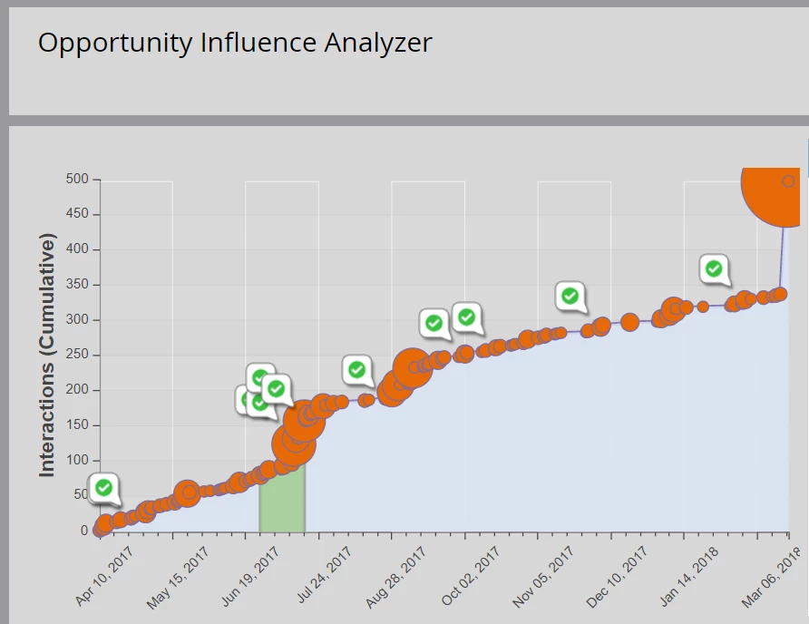
The above image is the bane of my existence.
Go ahead and try to click on the correct orange bubble to see a successful marketing interaction. I'll give you $20 if you can.
Easy solution: make the white/green "check boxes" clickable with the same data that exists inside the orange bubble.
Please, God...
Edit: Please move to the idea section if needed, thanks!