Hey LK,
Thanks for getting the page approved so I could have a quick look. On my end, everything seems to be showing as-expected in Chrome on a PC. Were you using a different browser when you experienced this issue? I've attached a screenshot below to show you what Im seeing on my end when I pull up the page and resize it down to mobile:
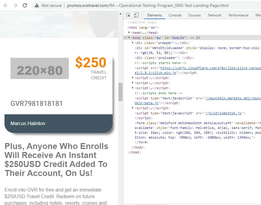
*note: There seems to be an error w/ the image URL so nothing is displaying in the image box when I load the page. I've added a placeholder in the inspector tools for example here.
I added a few styles into the dev console in the browser to try and see if we could stack the elements in there for mobile instead of having them shrink and stay in the same row. I was able to accomplish this using the flex-direction property and changing it from "column" (for mobile, stacked) to "row" (for mobile+, horizontal) as you go from mobile to tablet and up. There's a few other adjustments in the CSS to deal with the spacing of the element in the different orientations, let me know if you've got questions about anything here.
/* mobile styles first ( <480px) */

/* display flex container as a column to stack items and center justify them */
.eu .sec4_inner_left {
    flex-direction:column;
    justify-content: center;
    margin-bottom:20px;
}

/* center align image and add some spacing top/bottom */
.eu .sec4_left_logo {
    padding:0px !important;
    text-align:center;
    margin:20px 0;
}

/* mobile (landscape) and up styles next (480px+) */
@media screen and (min-width:480px) {
    /* adjust flex container orientation (row instead of column = horizontal display) */
    .eu .sec4_inner_left {
        flex-direction:row;
        justify-content: normal;
    }
    /* add padding back around logo image */
    .eu .sec4_left_logo {
        padding:20px !important;
    }
    /* justify $250 credit text to right */
    #sec4_credit_text {
        margin-left:auto;
    }
}
... and here's what Im seeing in mobile view with these styles added to the page:

In terms of implementing this, it'd be best to modify the stylesheet (arr_style.css) at the source of these styles. You'll notice there's an "!important" flag on the logo padding to work around the existing padding set on the arr_style file.
Next best thing would be to dump them into a <style> tag inside the Edit Page Metatags menu under Custom HEAD HTML to populate them at the page level. That'd end up looking something like this:
<style>
/* remove this line and replace it with the CSS above */
</style>
1) Let me know if you're using a different browser when you're seeing things get pushed out of the container on mobile
2) or if you've got any questions/issues with putting the code above into play or testing it out.
Thanks again,
Dave