Marketo Responsive Email Templates Rendering Differently on Mobile in Gmail/Outlook vs. iPhone
I've imported numerous Marketo email responsive templates and have noticed a difference in rendering on mobile platforms between Gmail/Outlook (on both Android and iOS) versus the iOS email app. The iOS version re-flows the layout to stack rows of horizontal content to vertical content to make them look more readable on smaller screen devices such as mobile. I'm not seeing this take place on Gmail/Outlook and I'm using Litmus to conduct my rendering tests.
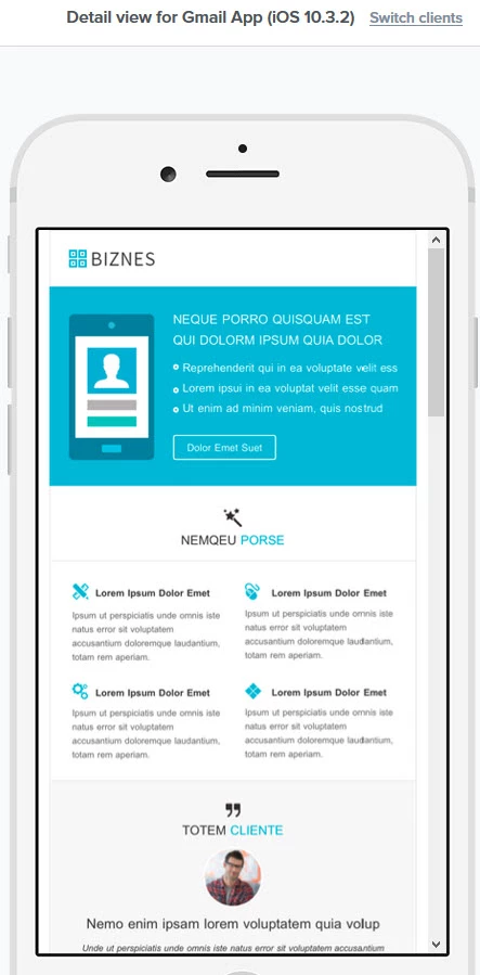
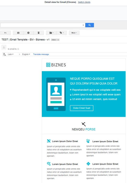
The screenshots below illustrate the issue. The Gmail version looks just like the desktop version while the iOS reflows the cells to stack the images and text vertically.
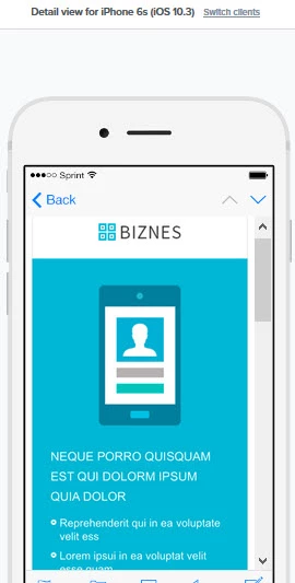
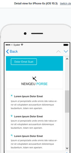
Both images below are from the same iOS email. The one on the left is the top of the email and the image on the right is the bottom part of the email.
Are there any known solutions to this issue?