line breaks in mobile responsive templates | Community
Skip to main content
January 5, 2015
Solved

line breaks in mobile responsive templates

  • January 5, 2015
  • 2 replies
  • 1523 views
I used one of the Marketo mobile responsive email templates for a recent trigger campaign (anniversary email). 

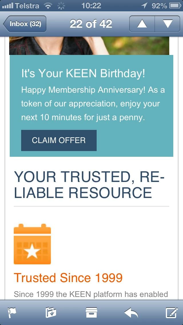
I notice that when I view the emails on mobile the copy in the headline will often extend to a second line, with the word at the end of the top line broken up with a hyphen (see "Reliable" copy in bottom half of screen shot below). 

Would appreciate advice ensuring that the copy doesn't wrap like this. 

Thanks!!

Geoff

This post is no longer active and is closed to new replies. Need help? Start a new post to ask your question.
Best answer by Matt_Stone2
You should be able to control this with the CSS, though it will probably take an effort across different email clients. I'd start here and look at { hyphens: } in particular. https://kenneth.io/blog/2012/03/04/word-wrapping-hypernation-using-css/

2 replies

Matt_Stone2
Matt_Stone2Accepted solution
Level 9
January 5, 2015
You should be able to control this with the CSS, though it will probably take an effort across different email clients. I'd start here and look at { hyphens: } in particular. https://kenneth.io/blog/2012/03/04/word-wrapping-hypernation-using-css/
Level 7
May 16, 2015

Hey Geoff,

If you don't want to mess around with HTML and CSS anymore, check out www.knak.io.

Will give you all the code for responsive templates that has been tested in Litmus, and you can just worry about editing it in the Marketo WYSIWYG editor.