Email 2.0 and image sizes
Perhaps this has been explained elsewhere, in which case please point me to the right thread; a quick scan did not uncover it.
In our template we're experiencing graphic stretching in desktop views or when a reply is made. Here is an example:

When the window is resized to force a mobile view, it works fine.
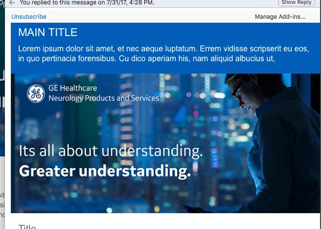
I'm not sure what's causing this to happen. We have the DIV set to allow image resizing and I've removed code that forces an image size.
Here is the HTML:
<table width="100%" border="0" cellspacing="0" cellpadding="0" class="mktoModule" mktoname="banner_section" id="banner_section20372451-a7e0-4a19-8221-72d42ac8e1e4">
<tbody>
<tr>
<td>
<div class="mktoImg" mktoName="banner_600x400" mktoLockImgSize="false" id="banner_120372451-a7e0-4a19-8221-72d42ac8e1e4">
<a href="#" target="_blank"><img src="landing1.gehealthcare.com/rs/005-SHS-767/images/banner_600x400.jpg" alt="image size _600x400" class="em_full_img" style="display: block;max-width: 600px;" border="0" /></a>
</div></td>
</tr>
</tbody>
</table>
And, for reference the relevant CSS:
body { margin: 0 !important; padding: 0 !important; -webkit-text-size-adjust: 100% !important; -ms-text-size-adjust: 100% !important; -webkit-font-smoothing: antialiased !important; }
img { border: 0 !important; outline: none !important; }
p { Margin: 0px !important; Padding: 0px !important; }
table { border-collapse: collapse; mso-table-lspace: 0px; mso-table-rspace: 0px; overflow: hidden; }
td, a, span { border-collapse: collapse; mso-line-height-rule: exactly; overflow: hidden; }
.ExternalClass * { line-height: 100%; }
.em_white a { color: #ffffff !important; text-decoration: none !important; }
span.MsoHyperlink { mso-style-priority: 99; color: inherit; }
span.MsoHyperlinkFollowed { mso-style-priority: 99; color: inherit; }
.em_nogap div { display: block !important; font-size: 0px !important; line-height: 0px !important; }
.em_grey a { color: #63666a !important; text-decoration: none !important; }
.em_blue a { color: #005eb8 !important; text-decoration: none !important; }
.em_grey2 a { color: #4b4d52 !important; text-decoration: none !important; }
@media only screen and (min-width:481px) and (max-width:649px) {
.em_main_table { width: 100% !important; }
.em_wrapper { width: 100% !important; }
.em_full_img { width: 100% !important; height: auto !important; max-width: none !important; }
.mktoModule { width: 100% !important; }
.em_hide { display: none !important; }
.em_height { height: 20px !important; }
.em_space { width: 15px !important; }
.em_center { text-align: center !important; }
.em_left { text-align: left !important; }
.em_pad { padding: 20px 15px !important; }
.em_pad2 { padding-bottom: 20px !important; }
.em_pad1 { padding-bottom: 15px !important; }
.em_grey2 { height: auto !important; }
}
@media only screen and (max-width:480px) {
.em_main_table { width: 100% !important; }
.em_wrapper { width: 100% !important; }
.em_full_img { width: 100% !important; height: auto !important; max-width: none !important; }
.mktoModule { width: 100% !important; }
.em_hide { display: none !important; }
.em_height { height: 20px !important; }
.em_center { text-align: center !important; }
.em_left { text-align: left !important; }
.em_space { width: 15px !important; }
.em_pad2 { padding-bottom: 20px !important; }
.em_pad1 { padding-bottom: 15px !important; }
.em_pad { padding: 20px 15px !important; }
.em_grey2 { height: auto !important; }
}