Customizing submit button width and color | Community
Skip to main content
March 18, 2015
Question

Customizing submit button width and color

  • March 18, 2015
  • 9 replies
  • 4051 views
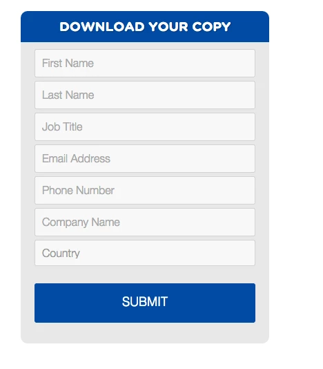
I'm wondering if anyone has experience editing a submit button to look like the attached. Can you steer me in the right direction? Thank you.

This post is no longer active and is closed to new replies. Need help? Start a new post to ask your question.

9 replies

SanfordWhiteman
Level 10
March 19, 2015
The button is actually a <button> inside a <span>.

Anyway, you can target it using this selector.  Should have high enough selectivity to override the built-in styles.

.mktoForm span.mktoButtonWrap.mktoSimple button[type="submit"].mktoButton

I'm not going to do any color-matching or anything like that so here's a basic example:

.mktoForm span.mktoButtonWrap.mktoSimple button[type="submit"].mktoButton {
  width: 240px;
  background-color: darkslateblue;
  background-image: none;
  border: none;
  height: 3em;
  font-size: 24px;
  border-radius: 4px;
}
Level 4
March 19, 2015
use

background-color: #004FA2;

to make the button that color
March 19, 2015
Thanks for your response. I still can't get it to work. Not sure if I'm adding the code in the right spot. I'm attaching a screen shot of the code I added and how the button currently looks.
March 19, 2015
Can the corners of all the fields be rounded to match the "Select" Box?
March 19, 2015
Here is all the code from all the form custom css section:

/* Add your custom CSS below */


.mktoForm span.mktoButtonWrap.mktoSimple button[type="submit"].mktoButton {
  width: 240px;
  background-color: #DA0000;
  background-image: none;
  border: none;
  height: 3em;
  font-size: 24px;
  border-radius: 4px;
}

.mktoForm fieldset {
  border:1px solid #fff;
  color:#d9d9d9;        
}
.mktoForm fieldset legend{
  padding:0.9em;
}

.mktoForm input[type=text],
.mktoForm input[type=url],
.mktoForm input[type=email],
.mktoForm input[type=tel],
.mktoForm input[type=number],
.mktoForm input[type=date],
.mktoForm select.mktoField,
.mktoForm textarea.mktoField{
  -webkit-appearance: none;
  background-color:#FFF;
  line-height:1.8em;
  color:#b1b1b1;
  border:1px solid #d9d9d9;
  border-radius:1.5;
  padding:0.4em 0.5em;
  min-height:1.9em;
}


.mktoForm input[type=text]:focus,
.mktoForm input[type=url]:focus,
.mktoForm input[type=email]:focus,
.mktoForm input[type=tel]:focus,
.mktoForm input[type=number]:focus,
.mktoForm input[type=date]:focus,
.mktoForm textarea.mktoField:focus,
.mktoForm select.mktoField:focus{
  outline:none;
  border-radius:0.9;
  border:1px dashed #666666;
}

.mktoForm div.mktoLogicalField {
  border:1px solid transparent;
}

.mktoForm input.mktoField.mktoInvalid,
.mktoForm select.mktoField.mktoInvalid,
.mktoForm textarea.mktoField.mktoInvalid,
.mktoForm div.mktoLogicalField.mktoInvalid{
  border:1px solid red;
}

.mktoForm select.mktoField::-ms-expand {
  display: none;
}

.mktoForm select.mktoField {
  -moz-appearance: none;
  text-indent: 0.01px;
  text-overflow: '';
  padding:0.2em 22px 0.2em 0.3em;
  background:#FFF url(../images/arrow-down-bk.png) center right no-repeat;
}

.mktoForm .mktoRadioList > label,
.mktoForm .mktoCheckboxList > label{
  margin-bottom:0.6em;
  -webkit-user-select: none;
  -khtml-user-select: none;
  -moz-user-select: none;
  -ms-user-select: none;
  user-select: none;
}

.mktoForm input[type=checkbox],
.mktoForm input[type=radio] {
  width:1em;
  height:1em;
  opacity:0;
}

.mktoForm input[type=checkbox] + label:before,
.mktoForm input[type=radio] + label:before
{
  content: "";  
  position:absolute;
  width:1em;
  height:1em;  
  margin-left:-1.5em;
  line-height:1em;
  font-size:1em;
  border:none;
  background:#FFF;
}

.mktoForm .mktoLabelToLeft input[type=checkbox] + label:before,
.mktoForm .mktoLabelToLeft input[type=radio] + label:before{
  margin-left:0;
  right:0.3em;
}

.mktoForm input[type=checkbox]:checked + label:before,
.mktoForm input[type=radio]:checked + label:before {
  text-align:center;
  color:#000;
}

.mktoForm input[type=checkbox]:focus + label:before,
.mktoForm input[type=radio]:focus + label:before{
  border:none;
}

.mktoForm input[type=checkbox] + label:before{

}
.mktoForm input[type=checkbox]:checked + label:before{
  content:"\2713 ";
}

.mktoForm input[type=radio] + label:before{
  border-radius:1em;
}
.mktoForm input[type=radio]:checked + label:before{
  background-image:url(../images/dot-bk.png);
  background-position:3px 3px;
  background-repeat:no-repeat;
}

.mktoForm.mktoNoCheckedSupport input[type=checkbox] + label:before,
.mktoForm.mktoNoCheckedSupport input[type=radio] + label:before{
  display:none;
}
.mktoForm.mktoNoCheckedSupport select.mktoField,
.mktoForm.ie7 select.mktoField,
.mktoForm.ie6 select.mktoField {
  background-image:none;
  padding-right:0.3em;
}

}
Level 4
March 19, 2015
you may need to add !important to your css declaration.  so something like this

.mktoForm span.mktoButtonWrap.mktoSimple button[type="submit"].mktoButton {
background: 
#004FA2!important;
}
SanfordWhiteman
Level 10
March 19, 2015
@John W You don't need !important because

    .mktoForm span.mktoButtonWrap.mktoSimple button[type="submit"].mktoButton

has higher specificity than

   
.mktoForm .mktoButtonWrap.mktoSimple .mktoButton

@Mel P The CSS I posted is demoed here.

If you need advanced CSS customization I think you may have to hire a designer or at the very least post your actual URL.  Exchanging CSS snippets on this forum is really cumbersome.
March 19, 2015
Thanks, for your time John

It is still not recognizing that code. It looks like it is pulling button styling off an internal styling sheet for the form?

See attached
December 29, 2016

Use .mktoForm span.mktoButtonWrap.mktoInset button[type="submit"].mktoButton

As you are use Inset type of button you cannot use mktoSimple. Change this class based on type of button you are using.

March 19, 2015
Any idea why the "select a country" button is the only one with rounded corners?