Facing Responsive issue while creating fragment | Community
Skip to main content
Level 2
February 21, 2024
Solved

Facing Responsive issue while creating fragment

  • February 21, 2024
  • 1 reply
  • 800 views

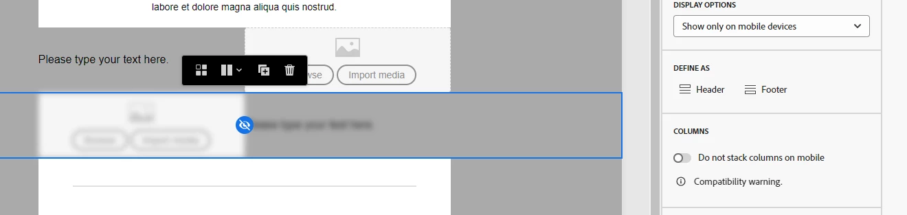
I have created a fragment. The right side should be image and the left side should be text, but in the mobile version, the image should come first, and the text should come next, not like the default behavior of the fragment. 

It would be great for me if you guys solved the issue.


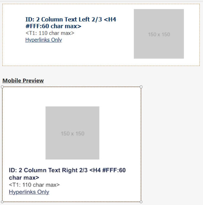
Mobile version should be like above but it is coming like below.


Regards

Satya

This post is no longer active and is closed to new replies. Need help? Start a new post to ask your question.
Best answer by Manoj_Kumar

Hello @chandanasa 


Duplicate the column and swap the text and image content.


Now you have 2 columns for each view.


You can then change the visibility for Mobile and Desktop devices.


It would look something like this:


1 reply

Manoj_Kumar
Community Advisor
Manoj_KumarCommunity AdvisorAccepted solution
Community Advisor
February 22, 2024

Hello @chandanasa 


Duplicate the column and swap the text and image content.


Now you have 2 columns for each view.


You can then change the visibility for Mobile and Desktop devices.


It would look something like this:


Manoj  | https://themartech.pro
Level 2
February 29, 2024

Hi Manoj,


we have created the fragment as like above but when I apply this fragment to the email template, it is not working fine. it will be visible both in the desktop as well as mobile.


it is in the fragment.


after putting this fragment into the template.


Please help me for this.


Regards

Satya


Manoj_Kumar
Community Advisor
Community Advisor
February 29, 2024

Hello @chandanasa 


You will have to select the device visibility from the option given on right side.

Check my screenshot again it has that option enabled.

Manoj  | https://themartech.pro