Create a component that consists of two nested containers | Community
Skip to main content
Level 3
October 20, 2022
Solved

Create a component that consists of two nested containers

  • October 20, 2022
  • 1 reply
  • 1182 views
Hi all, AEM newbie here,

It is possible to create a component that by default nest one container inside another container?
 

Just to give some context, I need this to apply a responsive padding to the outer container, with an inner container intended to be edited. Of course the user can drag and drop one container inside another manually, but this would be too tedious for them.

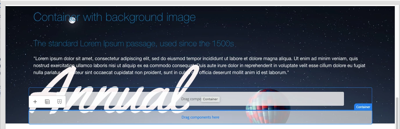
I have tried using `cq:template`, but that seems to be more for a "static" component with defined properties than the container component where you can drag and drop anything inside. I have also tried hard-coding the outer container in html, but AEM only renders one single container.
 
How can we create a component, when dragged into the AEM page editor, gives a container with another container inside?

Thanks,
This post is no longer active and is closed to new replies. Need help? Start a new post to ask your question.
Best answer by arunpatidar

I have this implemented using core container component, I have container component with margin/padding

.cmp-container--main-content>.cmp-container>.aem-Grid>.aem-GridColumn.aem-GridColumn--default--12 {
    margin: 0 5rem;
    max-width: 85rem;
    background: #fff;
    padding: 1rem;
}

this can be added only in edit/preview mode as well

.cmp-container--main-content>.cmp-container>.aem-Grid>.aem-GridColumn.aem-GridColumn--default--12.cq-Editable-dom {
    margin: 0 5rem;
    max-width: 85rem;
    background: #fff;
    padding: 1rem;
}

OR

.aem-AuthorLayer-Preview .cq-Editable-dom--container, .aem-AuthorLayer-Preview .cq-Editable-dom--container.aem-GridColumn {
    padding-top: 0;
    padding-bottom: 0;
}
.cq-Editable-dom--container, .cq-Editable-dom--container.aem-GridColumn {
    padding-top: 1.25rem;
    padding-bottom: 1.25rem;
}


1 reply

arunpatidar
Community Advisor
arunpatidarCommunity AdvisorAccepted solution
Community Advisor
October 20, 2022

I have this implemented using core container component, I have container component with margin/padding

.cmp-container--main-content>.cmp-container>.aem-Grid>.aem-GridColumn.aem-GridColumn--default--12 {
    margin: 0 5rem;
    max-width: 85rem;
    background: #fff;
    padding: 1rem;
}

this can be added only in edit/preview mode as well

.cmp-container--main-content>.cmp-container>.aem-Grid>.aem-GridColumn.aem-GridColumn--default--12.cq-Editable-dom {
    margin: 0 5rem;
    max-width: 85rem;
    background: #fff;
    padding: 1rem;
}

OR

.aem-AuthorLayer-Preview .cq-Editable-dom--container, .aem-AuthorLayer-Preview .cq-Editable-dom--container.aem-GridColumn {
    padding-top: 0;
    padding-bottom: 0;
}
.cq-Editable-dom--container, .cq-Editable-dom--container.aem-GridColumn {
    padding-top: 1.25rem;
    padding-bottom: 1.25rem;
}


Arun Patidar