Weekly Aggregation in Visualizations Not Working | Adobe Higher Education
Skip to main content
iamjasona
Level 2
July 11, 2017
해결됨

Weekly Aggregation in Visualizations Not Working

  • July 11, 2017
  • 5 답변들
  • 6056 조회

In the recent past, I've successfully setup a few visualizations (line graphs) in Workspace with a weekly aggregation, but I'm struggling to get this to work now (while the data source is aggregated weekly, the visualization refuses to be anything other than daily). 

To do so, I created a simple free-form table with the "Week" dimension and then chosen whatever metric I'm interested in (e.g., Visits, Conversion, etc.).  From there, I create the visualization (right-click in the data table and choose Visualize).  This previously gave me a visualization that aligned to whatever time-based aggregation I chose, but not anymore.  If I wanted a daily grain in the visualization, I'd use the "Day" dimension in the data table....  Did something change in Workspace or have I simply lost my mind?

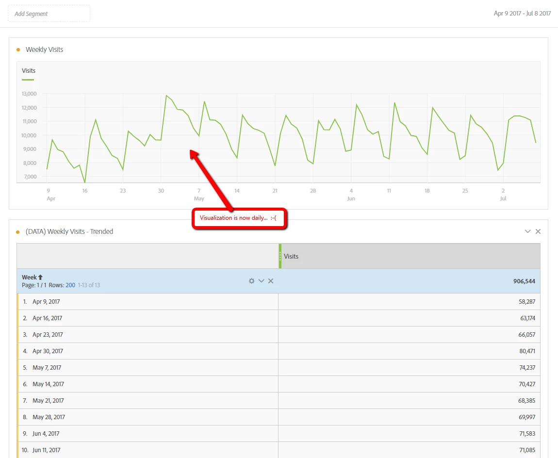
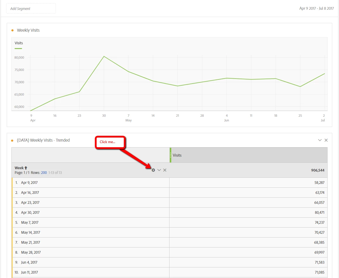
Interestingly, if I view the data table for any visualizations that I successfully created with a weekly grain in the past and then click the "gear" icon in the data table section, the corresponding visualization immediately changes from a weekly grain to a daily grain (example screens below).
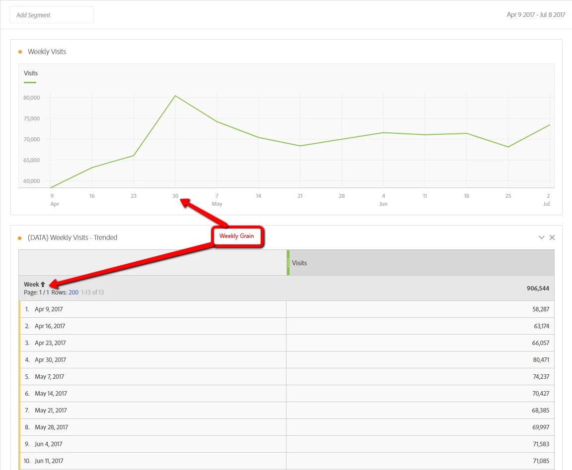
Before:

Click the Gear on the Data Table:

Visualization now aggregated daily....

이 주제는 답변이 닫혔습니다.
최고의 답변: Hyder_Ziaee

When using visualizations, in certain scenarios, it would create a table to power the visualization.

However, in the coming release on the 20th, we will be moving away from this from the reasons you have encountered.

Refer: Release Notes​ > Analytics > New Features in Adobe Analytics > Updates to “Manage Data Sources”

5 답변

WhoaShekhar
Level 10
July 12, 2017

Hi There,

Thanks for reaching out.

I apologize for the trouble you are experiencing. Can you click on the orange dot in the line chart next to "Weekly Visits" and try to lock the items? See if this helps.

As per my experience this isn't an issue and it shouldn't change like that. Also I would request to try another browser to reproduce the issue.

Tnx!

iamjasona
iamjasona작성자
Level 2
July 12, 2017

Thanks for the reply!

Unfortunately, locking the items in the chart didn't cause any different behavior.  Trying in a different browser also did not resolve the issue.

I did find a workaround for this, however.  In the visualization, if you choose "Show Data Source", it opens an entirely different data table than the one that was used to build the visualization initially.  Not surprisingly, it is using a Day dimension.  Changing this data table to use a Week dimension brings the associated visualization back to a weekly display.

I think that's really the issue.  Though I created a data table and used it to create a visualization, those two are not actually being linked.  Rather, a different underlying data table is being created and associated with the visualization - one with a daily aggregation.  Now that I know that is what is going on, it's more of a nagging "feature". 

Hyder_Ziaee
Adobe Employee
Adobe Employee
July 14, 2017

When using visualizations, in certain scenarios, it would create a table to power the visualization.

However, in the coming release on the 20th, we will be moving away from this from the reasons you have encountered.

Refer: Release Notes​ > Analytics > New Features in Adobe Analytics > Updates to “Manage Data Sources”

WhoaShekhar
Level 10
August 3, 2017

Hi,

As mentioned by Hyder above, this issue has been fixed and now it doesn't automatically create a new table. It will link the visualization to the table you generated it from.

Thanks!

iamjasona
iamjasona작성자
Level 2
August 4, 2017

I can confirm - thanks, guys!