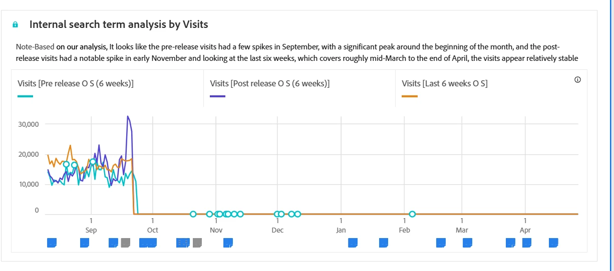
@sunilaad1 are the three components you're using custom date ranges that are all the same length but during different? When you create a line graph, it's going to start everything at the same point. So if you have three date ranges, for example, May, June, and July, they're all different months, but when you put them in the same graph, it will start them all at the same point. Same way that freeform tables work with trying to line up date ranges in different columns.
What I would suggest to do instead is to use annotations to identify individual periods. When you hove over it, it will show you the entire time period that the annotation applies to.
You can also use different colours for different annotations so that they are easier to see and know what each is.