Section Headers & Table Of Contents - Possible ways to improve
Both the Section Headers and Table Of Contents have been good additions for making reports easier to read and navigate through - though have got a couple of thoughts on how they might be able to be improved further.
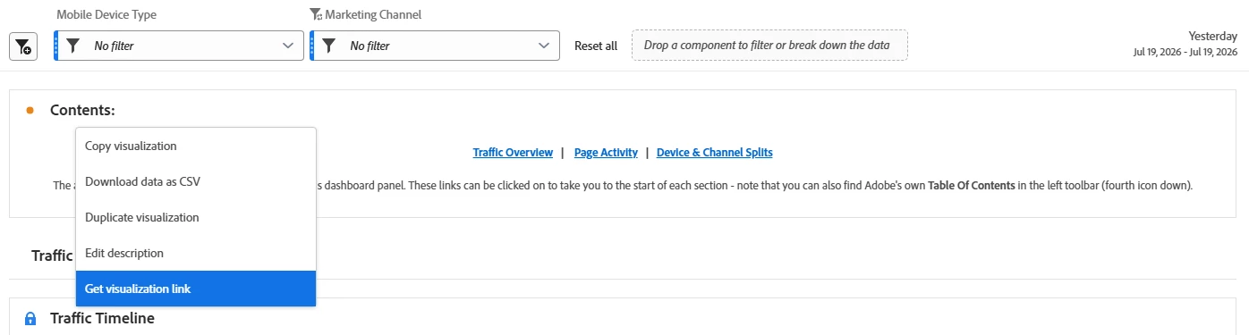
1) Add the full set of right-click functionality to Section Headers - At present, the only way that the Section Header visual can be interacted with is changing the text; the right-click menu that exists with other visualisation types isn’t there. However, I think it would be good to change this for two main reasons.
- ‘Edit description’ - This could be used to enable the adding of a short description or subtitle, between the main title and the line underneath the visualisation.
- ‘Get visualisation link’ - It would be good to be able to link directly to a Section Header. As a user who often adds an Introduction or Contents section to tell users what they can find in a report, it’s nice to add links in, but currently you have to link to any other visual that’s close to the Section Header instead. Although doing this ‘Contents’ part does overlap with the Table Of Contents feature, I find a) many more ‘casual’ users are still unaware it exists, and b) this written text is far easier to quickly understand due to the next point…
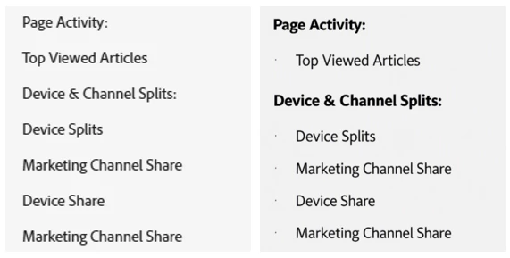
Distinguish Section Headers in the Table Of Contents - In the below image of the Table Of Contents on the left, you can’t instantly see which lines are Section Headers. As a result it’s a lot more tricky to find what you’re looking for and understand what’s in the panel. Some possible changes (as per the right) that could improve this may be adding bold text to Section Headers, indenting any text that isn’t a Section Header, or even adding in icons to distinguish the visualisation type next to each line.
At the moment I often find myself adding colons to the text of these visuals only, or adding extra Section Headers with ‘-’ as the title to create a space, as something of a workaround to get them to be somewhat visually identifiable.
With these changes though, hopefully it would make dashboards easier to read and navigate.