
Remove circles from line charts | Community
Skip to main content
jorisdebeer
Level 4
March 19, 2018
Solved

Remove circles from line charts

  • March 19, 2018
  • 13 replies
  • 11972 views

Since the February release of Adobe Analytics workspace, line charts have little circles around many data points, even when Show Anomalies has been turned off.

The circles obscure the data, and make it harder for the readers to view the trend.
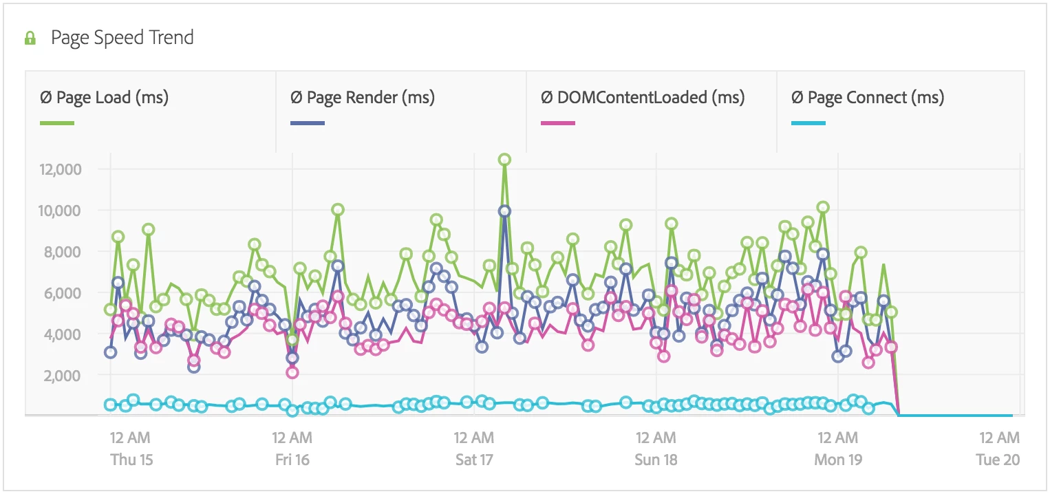
Is there an option to turn the circles off somehow? If I hover my mouse cursor over the data table, then the circles are hidden, but this is not very user friendly.

This post is no longer active and is closed to new replies. Need help? Start a new post to ask your question.
Best answer by jorisdebeer

Clientcare have confirmed this is a bug, and expect a fix in the next release.

13 replies

Gigazelle
Adobe Employee
Adobe Employee
August 7, 2018

jorisdebeer - Did you get a confirmation that this was fixed? Do you have either a bug ID or incident number that I can reference to resolve this forum thread?

jorisdebeer
Level 4
August 8, 2018

Hi Gigazelle​,

Below is the reply I received:

[Incident: 180320-000027]

The bug raised with the Engineering team has confirmed that the fix of this issue would be released in April. Please let me know if there is anything else I may assist you with and I would be glad to take it forward?

Gigazelle
Adobe Employee
Adobe Employee
August 8, 2018

Perfect - confirmed as closed on Adobe's end as well. Thanks so much!