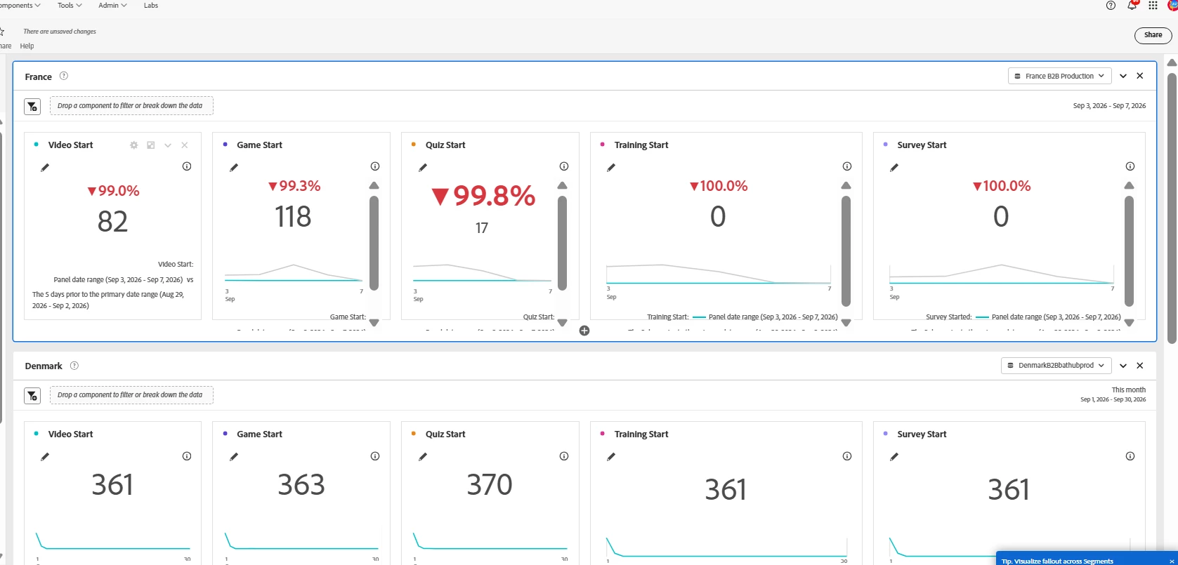
To stop Adobe Analytics reports from auto‑showing red percentage changes and comparison trendlines when you change the date range, you need to adjust the Comparison Date Range settings in your visualization. The issue occurs because the comparison is set to a relative date range, which auto‑updates whenever the primary date range changes. Switching it to fixed or removing the comparison entirely will prevent percentages from reappearing.
Please follow the below steps -
- Open the Visualization Settings and Go to your Key Metric Summary or Freeform table visualization. and Click the gear/settings icon.
- check the comparison date range and If it’s set to a relative option (like “Previous period”), change it to Fixed date range or None. clear the comparison date range entirely if If you don’t want any comparison.
- Uncheck Show percent change and comparison trendline
-
Ensure the visualization uses Panel date range only, without auto‑comparison and Save the workspace so the settings persist across date changes.
Hope this will help.