Is there anyway to put a date range on a line graph | Community
Skip to main content
Level 1
January 31, 2026
Question

Is there anyway to put a date range on a line graph

  • January 31, 2026
  • 1 reply
  • 3 views

I have a Workspace dashboard that uses three visualizations for page level performance.

A Summary Number showing last week’s value
A Key Metric Summary showing week over week change last week vs the prior week
A line graph showing a 5 week trend for the same metric

The issue is that the team wants this dashboard to be usable for any selected week, not just the current one.

For example, if a user sets the panel calendar to the week of Christmas, they expect:

The Summary Number to show the week before Christmas
The Key Metric Summary to compare the week before Christmas to the week before that
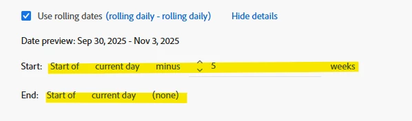
The line graph to show the 5 weeks leading up to the selected week

I know that for the Summary Number and Key Metric Summary, I can create relative date ranges and enable “Make date range component relative to panel calendar,” and those update correctly when the panel date changes.

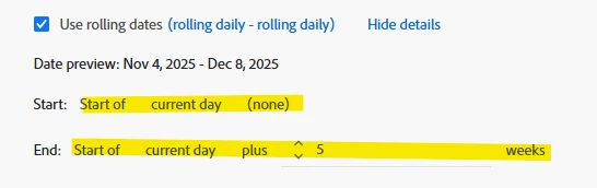
However, the only way I’ve been able to get the line graph to show a 5 week trend is by selecting a 5 week date range directly in the panel calendar. When I do that, the Summary Number and Key Metric Summary then use the start of that 5 week range as their reference point, which breaks the intended logic. Instead of seeing last week, week over week, and a 5 week trend, I end up seeing a 5 week trend plus two weeks prior to that.

What I’m trying to figure out is whether there’s a way to apply a relative date range directly to the line graph itself, so it always shows the 5 weeks leading up to the panel calendar selection, without forcing the entire panel to be set to a 5 week range.

Is this possible in Workspace, or is this a current limitation of how panel level date ranges work?

1 reply

Jennifer_Dungan
Community Advisor and Adobe Champion
January 31, 2026

Unfortunately, at this time, Adobe doesn’t really support “relative” comparisons.


Now, if you are always going to be doing a “5 week comparison”, I think there is a way to sort of hack a solution.


If you make enable your panel for “Make date range components relative to panel calendar” and then select only a single day (the first day of the “new” date range).

Then you can create 2 custom date ranges (for my examples, I have Nov 4th selected for my panel)


Range 1 “Previous 5 Weeks” (relative to the 1 selected day):


and Range 2 “Current 5 Weeks” (relative to the selected day):


This way, you will always get a 5 week period before/after the 1 selected day.


However, like I said, there is no way to make the date ranges reflect a changing “range” (i.e. Select 1 Week following Christmas and show the preceding 1 week, then change to 3 Weeks after New Years and show preceding 3 weeks).


If you need that, the only solution I have for that is to build a Report Builder report. Provide start and end date cells, then use excel date math to calculate the appropriate span of time relative to the selection.

Then create Report Builder requests that use the visible “start and end dates” and additional requests that use the hidden calculated start and end date.

This would require that anyone using the report to have Report Builder access, so they can log in, change the date range and run the report.


There are ways to pull the data into hidden “raw data sheets” and graphing the results based on how many rows of data exist.


It’s not ideal… but it would technically serve your purpose.


Short of that, I know there have been requests for proper relative comparisons posted here, but I am having trouble finding them. We just have to keep asking for improvements to date comparisons and hope that one day this becomes easier.