Hi ÁlvaroGa5,
This is a classic and very common point of confusion with averages in analytics. The other replies are on the right track—it comes down to what is called the "average of averages."
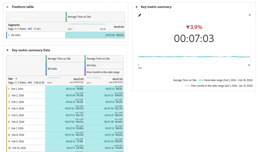
Here is the mathematical explanation for the difference you are seeing:
-
In the Freeform Table (broken down by Day): The table first calculates an average time on site for each individual day. Then, it takes those daily averages and averages them together to show you the final number in the table. This is an average of averages.
-
In the Key Metric Summary (for "All Visits"): This takes the total time on site from every single visit in the entire date range and divides it by the total number of visits. This is the true, overall average.
Why they are different: The average of averages (in the table) can be skewed if you have days with very few visits. For example, a day with only 2 visits that both lasted a long time will pull the table's average up more than it should, compared to the overall metric which correctly weights each visit equally.
In calculus terms, it is the difference between looking at the average rate of change over a large interval (the Key Metric Summary) versus looking at the average of many smaller intervals' rates (the table).
To get the table to match the Key Metric Summary, you would need to calculate a "Weighted Average" of the daily times, where each day's average is multiplied by the number of visits that day before averaging. This gives more importance to days with more traffic.
I built a free step-by-step calculus tool (Derivative Calculus) to help people visualize exactly these kinds of mathematical relationships, like how a rate changes across different intervals. Understanding this "average vs. average of averages" is a perfect real-world example of the concept.
Hope this helps clarify what you are seeing in your data!