Question
Has there been a recent change in visualisations border spacing and width?
<Update - Looks like this was a bug and it's been resolved - yay!>
Hi AA community! Long time follower, first time poster 🙂
I can't see anything in the latest Analytics release notes but has there been recently an update so that visualisations modules no longer have a gap between each other and instead they 'connect' together? I've seen this on when using Graphs and Summary Changes modules mainly (key info has been redacted)
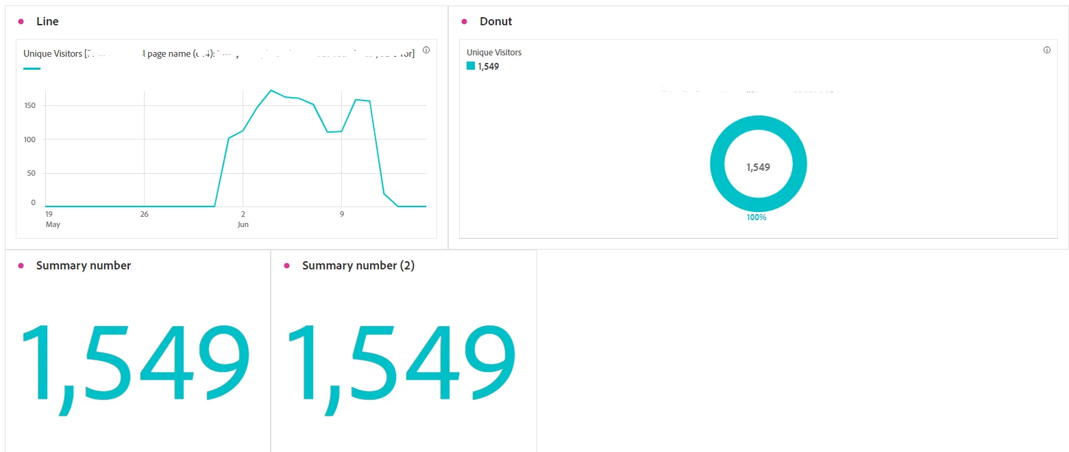
It also seems that the visualisation width is wider than the dashboard. It also seems that the visualisation width is wider than the dashboard so it's triggering a few OCD dashboard users 🙂 - example of borders shown below

Thanks in advance for your responses!