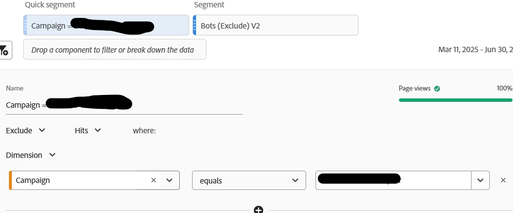
Exclude filter have a different colour or other indication it is an exclude
When a quick filter is set to Exclude, it looks like an include filter.
It is confusing when looking at reports.
To address this, when creating a quick filter that is an exclude, can this have a visual indication that it is an exclude?
Maybe make it Red rather then Blue. But conscious that some other accessible (not just colour) indication would be best to have also.
At the moment, it isn’t able to be seen unless the filter is opened for editing and it leads to confusion, as it looks the same as an include filter.
This is in the workspace in Adobe Analytics and the workspace in Customer Journey Analytics.