Comparison Date Range | Community
Skip to main content
Level 1
August 5, 2026
Solved

Comparison Date Range
  • August 5, 2026
  • 2 replies
  • 53 views

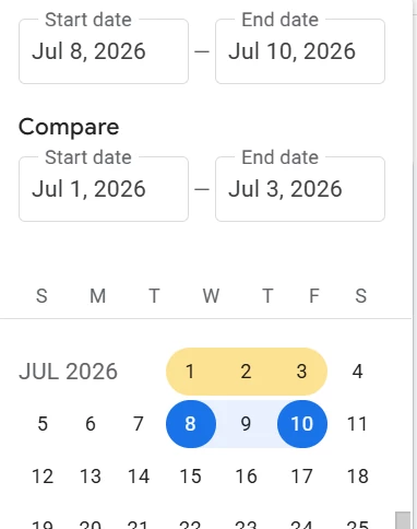
This is available in GA4. Is this available in Adobe Analytics, panel date .
 

Best answer by Jennifer_Dungan

I had a discussion with the Adobe Product team about date comparisons and potential improvements, as I see this type of post all the time…


But we also have to take into consideration that the way reporting is designed is very different between the two systems… Adobe doesn’t restrict people to just two date columns, you can have 2 or 3 or 4 or 20 if you so choose….. you can show them in any order, do different math calculations between different columns… the “simplistic” compare that GA4 provides doesn’t really fit in well to the more complex setup of Adobe Workspaces.


That said, perhaps a special panel (similar to Compare Segments) would allow for a simplistic “Date Compare” like you are suggesting (I will bring this up to the Adobe team next time I talk with them)


For Adobe, you have to create your own date comparison columns.


There are a few ways to do this.


Method 1:

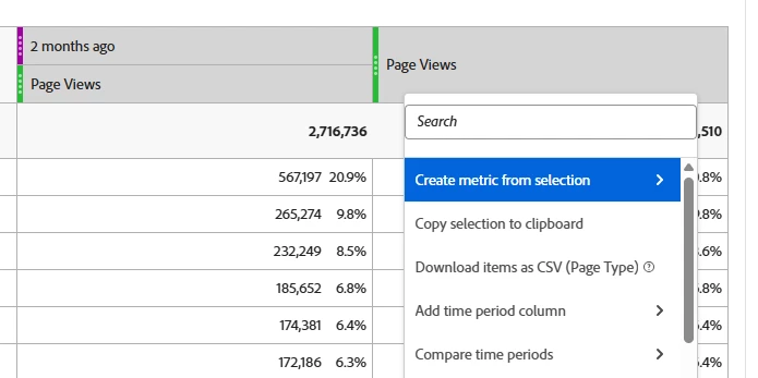
Build a table of data, then right click on your column and select either “Add time period column” or “Compare time periods”

Note: If you are using a time dimension (i.e. Day, Week, Month, etc), you will only get the “Add time period column”
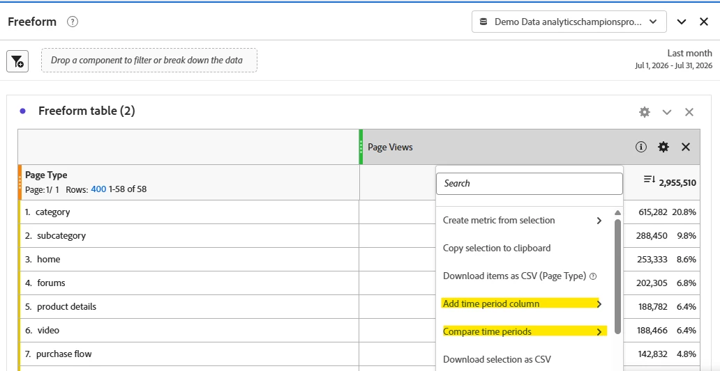
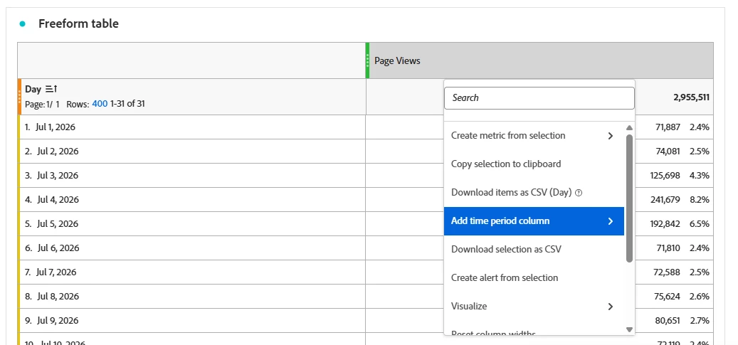


The fundamental difference is that “compare” adds a “Percent Change” calculation along with the date column.


Add Time Period Column:
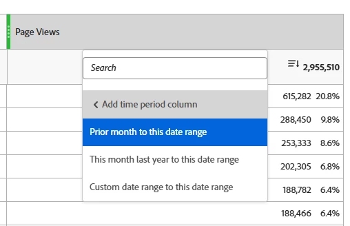


Compare Time Periods:


(both options have some pre-selected date ranges like “Prior month to this date range” , “This month last year to this date range”, as well as the option to customize your own date range.


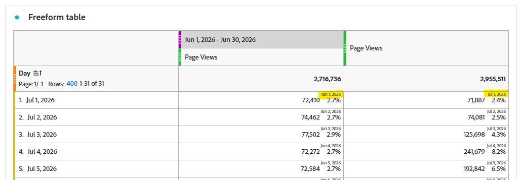
When a Time dimension is used, because the dates wouldn’t otherwise line up, you can see that text is added to show the comparison time frame:


Method 2:

Using the Key Metric Summary Visualization


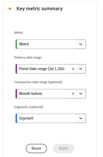
When you pull this into your panel, you will be given options to build out what you need, including the dimension you want to look at, the primary date range, the optional comparison date range, and any segments you need to apply to the visualization:


You can also do some customization of the display:


You can change the emphasis to the numeric value over the percent change, you can hide the trendlines, etc,


Method 3:

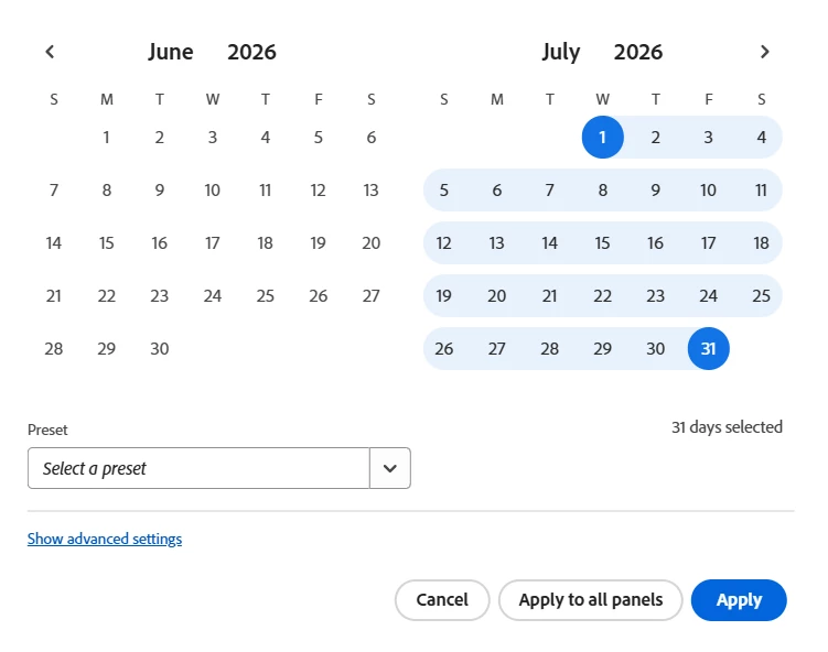
Use pre-defined date ranges, or manually create your own, and build your freeform table yourself.


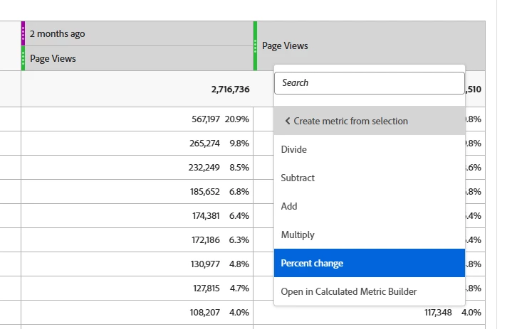
You can do your own math comparison columns as well


I hope this helps

2 replies

Jennifer_Dungan
Adobe Champion and Community Advisor
Jennifer_DunganAdobe Champion and Community AdvisorAccepted solution
Adobe Champion and Community Advisor
August 5, 2026

I had a discussion with the Adobe Product team about date comparisons and potential improvements, as I see this type of post all the time…


But we also have to take into consideration that the way reporting is designed is very different between the two systems… Adobe doesn’t restrict people to just two date columns, you can have 2 or 3 or 4 or 20 if you so choose….. you can show them in any order, do different math calculations between different columns… the “simplistic” compare that GA4 provides doesn’t really fit in well to the more complex setup of Adobe Workspaces.


That said, perhaps a special panel (similar to Compare Segments) would allow for a simplistic “Date Compare” like you are suggesting (I will bring this up to the Adobe team next time I talk with them)


For Adobe, you have to create your own date comparison columns.


There are a few ways to do this.


Method 1:

Build a table of data, then right click on your column and select either “Add time period column” or “Compare time periods”

Note: If you are using a time dimension (i.e. Day, Week, Month, etc), you will only get the “Add time period column”


The fundamental difference is that “compare” adds a “Percent Change” calculation along with the date column.


Add Time Period Column:
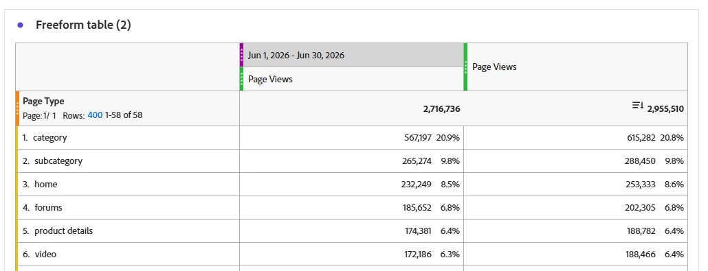


Compare Time Periods:
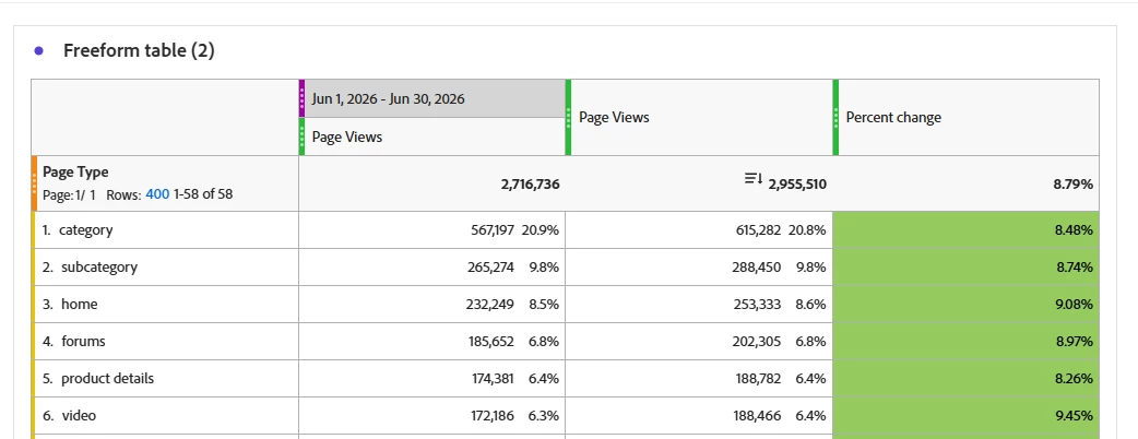


(both options have some pre-selected date ranges like “Prior month to this date range” , “This month last year to this date range”, as well as the option to customize your own date range.


When a Time dimension is used, because the dates wouldn’t otherwise line up, you can see that text is added to show the comparison time frame:


Method 2:

Using the Key Metric Summary Visualization
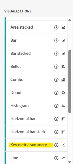


When you pull this into your panel, you will be given options to build out what you need, including the dimension you want to look at, the primary date range, the optional comparison date range, and any segments you need to apply to the visualization:
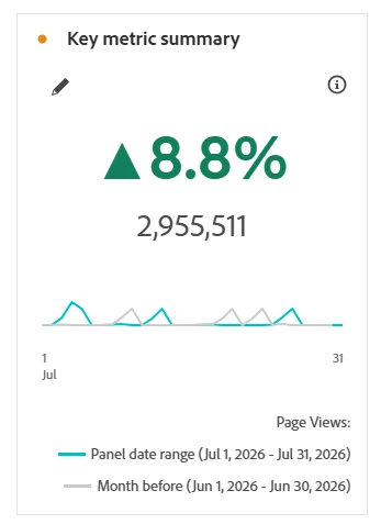


You can also do some customization of the display:
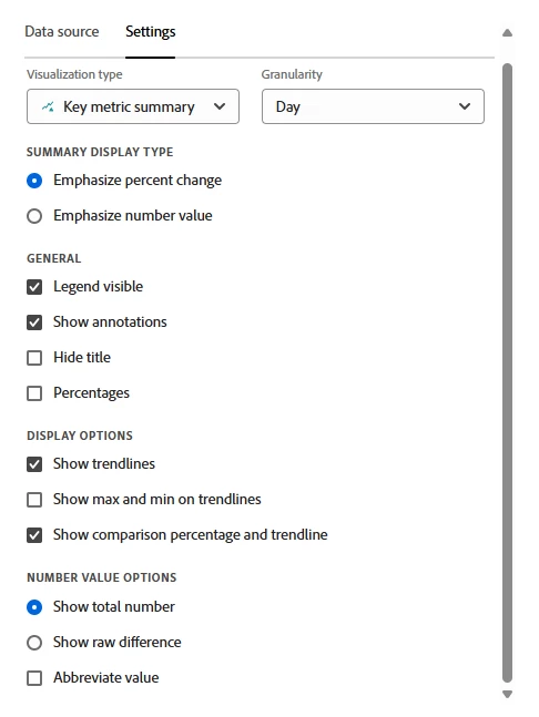
 

You can change the emphasis to the numeric value over the percent change, you can hide the trendlines, etc,


Method 3:

Use pre-defined date ranges, or manually create your own, and build your freeform table yourself.
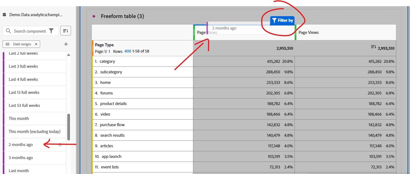


You can do your own math comparison columns as well


I hope this helps

manpreetkaur27
Adobe Support
Adobe Support
August 7, 2026

Thanks for sharing the detailed explanation, ​@Jennifer_Dungan 😊