Expand my Community achievements bar.

Announcing the launch of new sub-community for Campaign Web UI to cater specifically to the needs of Campaign Web UI users!

AC Tips & Tricks: How to easily include charts in email leveraging quickcharts.io

Avatar

Community Advisor

1/10/23

Introduction

Are you looking for an easy way to add charts to your email content? Look no further than QuickChart! QuickChart is a web service that allows you to generate chart images on-the-fly, making it simple to include interactive and informative visuals in your emails. These images are suitable for embedding in any format, including email, SMS, chatbots, and more. QuickChart uses Chart.js, a popular open-source charting library, to render the charts, ensuring that your charts are high quality and customizable to fit your specific needs. With QuickChart, you can easily add charts to your email content and make your message more engaging and informative.


In this blog, I am going to show you how to include personalized charts per recipient basis by leveraging quickcharts.io open source image generation service, head over to https://quickchart.io/documentation/ for more information and dev support.

Getting started

It perates by parsing JSON configuration and depicting data values into images. This can be done by sending the chart configuration in either JSON or JavaScript format through a POST reques or passing parameter configuration through request URL.


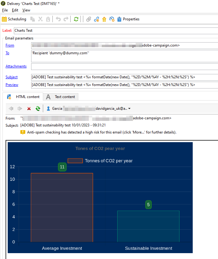
Take the following image for example.


David__Garcia_0-1673343157115.png


To generate the chart above, paste the following code into a delivery template, you may pass variables containing personalized data into the body of the JSON script, these values could be sourced from adobe campaign recipient data, which makes it ideal to generate personalized chart media.


<HTML>
<head>
</head>
<BODY>                    
                    <div>
                    <!---------------------CHART---------------->                        
                    <%                                        
                    var carbon = {
                    type: 'bar',
                    data: {
                        labels: ['Average Investment', 'Sustainable Investment'],
                        datasets: [{
                            label: 'Tonnes of CO2 per year',
                            data: [11, 5],
                            borderWidth: 1,
                            backgroundColor: ['rgba(234, 82, 4, 0.2)', 'rgba(0, 121, 109, 0.2)'],
                            borderColor: ['rgba(234, 82, 4, 1)', 'rgba(0, 121, 109, 1)'],
                        }]
                    },
                    options: {
                        plugins: {
                            datalabels: {
                                anchor: 'end',
                                align: 'top',
                                color: '#fff',
                                backgroundColor: 'rgba(34, 139, 34, 0.6)',
                                borderColor: 'rgba(34, 139, 34, 1.0)',
                                borderWidth: 1,
                                borderRadius: 5,
                            },
                        },
                        legend: {
                            labels: {
                                fontColor: 'white'
                            }
                        },
                        title: {
                            display: true,
                            text: 'Tones of CO2 pear year'
                        },
                        scales: {
                            xAxes: [{
                                ticks: {
                                    fontColor: 'white'
                                }
                            }],
                            yAxes: [{
                                ticks: {
                                    beginAtZero: true,
                                    fontColor: 'white'
                                },
                                gridLines: {
                                    color: 'rgba(255, 255, 255, 0.1)'
                                },
                            }]
                        }
                    }
                }
                    var link = "https://quickchart.io/chart?bkg=rgb(0,42,94)&c="+escapeUrl(JSON.stringify(carbon));
                  
                    %>
                    
                    <img width="600px" height"400px" src="<%=link%>"/>                                                          
                    <!---------------------CHART---------------->
                    </div>                   
</BODY>
</HTML>


Chart types

You can render all sorts of charts, head over to https://quickchart.io/documentation/chart-types/ for configuration types.

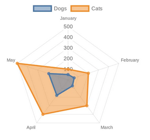
Radar chart


<img src="https://quickchart.io/chart?c={type:'radar',data:{labels:['January','February','March','April','May'],datasets:[{label:'Dogs',data:[50,60,70,180,190]},{label:'Cats',data:[100,200,300,400,500]}]}}">


David__Garcia_1-1673343570978.png

Hosting your own service

given that quickharts is open-source, it has been made available over github, head over to their repo for deployment instructions (https://github.com/typpo/quickchart)