Customer Journey Analytics
- Mark as New
- Follow
- Mute
- Subscribe to RSS Feed
- Permalink
- Report
How can one change line color for a line visualization type? There is no option in the line panel settings.
Thanks!
Solved! Go to Solution.
Views
Replies
Total Likes

- Mark as New
- Follow
- Mute
- Subscribe to RSS Feed
- Permalink
- Report
Both Adobe Analytics and CJA Workspaces do have colour control, but it's not as intuitive as you would think...
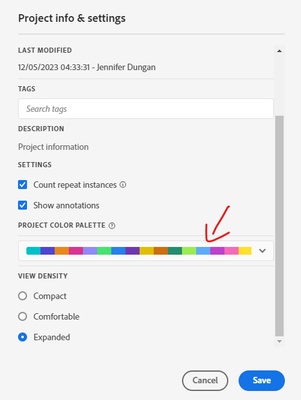
You cannot change individual visualizations at this time.. What you can do is change the colour palette for the entire project:
Project > Project info & settings
You can choose from some pre-defined palettes, or you can create a custom palette (possibly based on your org colour schema).
You can also set the colour palette in your own user settings as permanent setting (so you don't have to do this each time.. but it is per user, not something you can set for your company)
Views
Replies
Total Likes

- Mark as New
- Follow
- Mute
- Subscribe to RSS Feed
- Permalink
- Report
Both Adobe Analytics and CJA Workspaces do have colour control, but it's not as intuitive as you would think...
You cannot change individual visualizations at this time.. What you can do is change the colour palette for the entire project:
Project > Project info & settings
You can choose from some pre-defined palettes, or you can create a custom palette (possibly based on your org colour schema).
You can also set the colour palette in your own user settings as permanent setting (so you don't have to do this each time.. but it is per user, not something you can set for your company)
Views
Replies
Total Likes
- Mark as New
- Follow
- Mute
- Subscribe to RSS Feed
- Permalink
- Report
Thank you. Is this feature in a future roadmap?
Views
Replies
Total Likes

- Mark as New
- Follow
- Mute
- Subscribe to RSS Feed
- Permalink
- Report
To the best of my knowledge, no... but I also know that a lot of the Analytics Champions have definitely requested more granular colour controls...
If you post this as an idea, using the "why it's important, how it should work, current behaviour) format, I will definitely up-vote the idea (https://experienceleaguecommunities.adobe.com/t5/adobe-analytics-ideas/idb-p/adobe-analytics-ideas)
Being able to say lock "Value X" to blue, and "Value Y" to red across all visualizations (regardless of which one has the highest count), or just being able to make specific visualizations look better by adjusting their colours specifically would be a great feature... I mean the colour palette as a fallback is fine, but it doesn't always work well for all items in the report....
- Mark as New
- Follow
- Mute
- Subscribe to RSS Feed
- Permalink
- Report
Thanks Jennifer! I just posted the idea.


