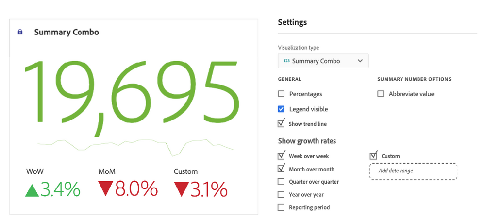
Add a new visualization that combines Summary Number, Summary Change and Line.
- Summary number
- Trend line that can be optionally displayed for the reporting period set in the panel or for a fixed period like last 30 days
- Most frequently used comparisons like WoW, MoM, QoQ, YoY
- Custom comparison — a user adds a date range that will be compared with the previous one (e.g. if custom date range equals Last 10 days, the comparison will be run with 10 days prior)
- Reporting period (works like Custom comparison; if the reporting period is last 30 days, the comparison will be run with 30 days prior)
This will significantly simplify dashboards as instead of 3-5 visualizations mapped to one or few tables, there will be a single vizualization mapped to a table to pull only the summary number from (the other values will be pulled automatically based on the settings rather than mapping to freeform tables).
Here is how it may look:
