Average values on reports

- Mark as New
- Follow
- Mute
- Subscribe to RSS Feed
- Permalink
- Report
Ok, I'm stuck. I need to create a report that shows me the average number of requests we have received per day this year. Currently I'm grouping by entry date (or the date the request was submitted) I can get a record count in my chart, but not an average. Probably because the date isn't a whole number...? This seems like it should be obvious to me, but I can't get it. Anyone?
Solved! Go to Solution.
Topics help categorize Community content and increase your ability to discover relevant content.

- Mark as New
- Follow
- Mute
- Subscribe to RSS Feed
- Permalink
- Report
Tricky one Samantha,
Assuming that there are 365 days per year (usually), that each person who raises an Issue has an FTE of 1, and that it is the average per day within a particular year you are after (e.g. grouping your report by Entry Date, yearly), mathematically you can think of each Issue raised as being "worth" 1/365, from a SUM perspective (e.g. 365 Issues raised would be 365/365 = 1 per day, on average), in which case, you can effectively achieve the annual average you seek by doing a SUM using this textmode (in an Issue report view column):
aggregator.displayformat=HTML
aggregator.function=SUM
aggregator.namekey=view.relatedcolumn
aggregator.namekeyargkey.0=enteredBy
aggregator.namekeyargkey.1=fte
aggregator.valueexpression=({enteredBy}.{fte}/365)
aggregator.valueformat=HTML
displayname=Average Issue(s) per Day
linkedname=enteredBy
namekey=view.relatedcolumn
namekeyargkey.0=enteredBy
namekeyargkey.1=fte
querysort=enteredBy:fte
textmode=true
valueexpression=({enteredBy}.{fte}/365)
valueformat=HTML
Regards,
Doug
Views
Replies
Total Likes

- Mark as New
- Follow
- Mute
- Subscribe to RSS Feed
- Permalink
- Report
Sounds very good @Doug Den Hoed‚
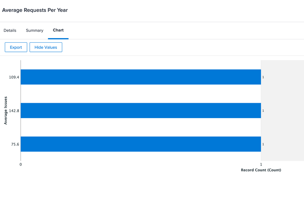
I tried the same and got this one. If you refer the attachment, just wondering about How to read this number in which context way?
Please refer the attachment
Best regards,
Kundan
Views
Replies
Total Likes

- Mark as New
- Follow
- Mute
- Subscribe to RSS Feed
- Permalink
- Report
Views
Replies
Total Likes

- Mark as New
- Follow
- Mute
- Subscribe to RSS Feed
- Permalink
- Report

Views
Replies
Total Likes

- Mark as New
- Follow
- Mute
- Subscribe to RSS Feed
- Permalink
- Report
Glad you like it, Samantha,
In order to chart, Workfront needs to "hit" data that is persisted in the database, so since this is calculated on the fly, it isn't eligible.
You could, however, periodically type it in to some custom data, such as a special "Annual Stats" Project, with a Task named and representing each year, with a custom data parameter called Average Issues Per Day, and then chart against those Tasks as a bar chart.
Regards,
Doug
Views
Replies
Total Likes

- Mark as New
- Follow
- Mute
- Subscribe to RSS Feed
- Permalink
- Report
Great workaround Doug! The information in an easy to read format is worth that. Thank you.
Views
Replies
Total Likes

- Mark as New
- Follow
- Mute
- Subscribe to RSS Feed
- Permalink
- Report
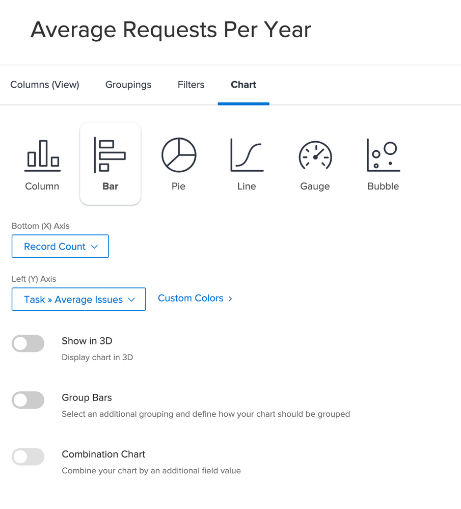
So I've done what you said and I'm a little stuck. I've got a project with the task name representing each year and another custom data parameter called average issues, but I'm struggling with the chart. I can't get anything but a record count on either of the data parameters.
I need my Y-Axis to be the month and the X-Axis to be the average issues. Help?!
Views
Replies
Total Likes

- Mark as New
- Follow
- Mute
- Subscribe to RSS Feed
- Permalink
- Report
Hi Samantha,
To get the chart you're after going:
- set the planned start date of each Task to be Jan 1 of the year it represents (noting that you might have to first backdate the start of your Project to the earliest among those, or even earlier, to be safe)
- create a Task report
- Add columns for Planned Start Date and Average Issues (respectively) to the view
- Click the Average Issues column, then set the "Summarize this column by:" to "Maximum" (or Minimum, or Average; each would suffice)
- Filter the report to only Tasks belonging to this special Project you've set up
- Group the report on Planned Start Date, then select by "year" in the dropdown
- Choose a Bar Chart as above, but with (now that they're available, thanks to the above) the Planned Start Date (by year) as the Y-Axis, and the Average Issues (Max, within that year, noting that there should be only one such entry) as the X-Axis
Regards,
Doug
Views
Replies
Total Likes


