Hi All,
Version : CQ5.6.1
In order to reduce the number of templates and allow teh authors some flexibility when creating teh pages we are planning to use a custom column control component(as suggested on some best practices forums). We following the guide
Steps to create a custom Column Control component:
- Create a new component named, “Page Division – Column Control”
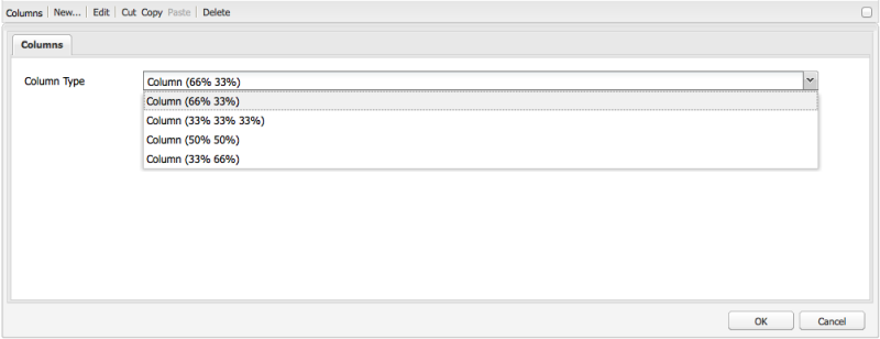
- Add a drop-down to your dialog with the various combinations of page divisions
- Add a DIV for each column represented by each selection in your component JSP
- Add a Paragraph System to each DIV in the component code to allow nesting.
<div class=”col-33″>
<cq:include path=”right-par” resourceType=”foundation/components/parsys” />
</div>- Add a style class for each entry in the drop-down in your CSS
I have some concerns with this aproach especially around responsivness. Will this aproach work with a responsive framework such as bootstrap?


