I would like to answer this question by starting with what is Responsive and Adaptive are:-
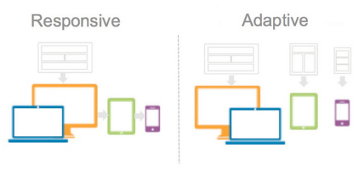
Responsive design works on the principle of flexibility - a single fluid website that can look good on any device. Responsive websites use media queries, flexible grids, and responsive images to create a user experience that flexes and changes based on a multitude of factors.
Responsive uses CSS media queries to change styles based on the target device such as display type, width, height etc., and only one of these is necessary for the site to adapt to different screens.
Responsive design is a technique in which the same HTML code is delivered to each device, but tweaks to CSS (which determines the layout of a web page) allow it to adjust to the screen’s form factor. To make this happen, like others have mentioned, you need to adopt a fluid grid and implement flexible images.
Adaptive design is more like the modern definition of progressive enhancement. Instead of one flexible design, adaptive design detects the device and other features, and then provides the appropriate feature and layout based on a predefined set of viewport sizes and other characteristics.
Adaptive design uses static layouts based on breakpoints which don’t respond once they’re initially loaded. Adaptive works to detect the screen size and load the appropriate layout for it.
Adaptive design, the most significant difference is that the server hosting the website detects the devices making requests to it, and uses this information to deliver different batches of HTML and CSS code based on the characteristics of the device that have been detected.
The site detects the type of device used, and delivers the per-set layout for that device. So instead of a single ball going through several different-sized hoops, you’d have several different balls to use depending on the hoop size.
Responsive websites generally work well for content-heavy websites with not a lot of difference in user intent between mobile users and desktop users, and fairly simple functionality.
Adaptive websites, on the other hand, shine in most cases where user intent on mobile differs significantly, and website performance becomes a crucial factor in determining visitor conversion and satisfaction, such as in e-commerce websites.
While both responsive design and adaptive delivery have their own merits, which one is right for you can be answered by putting your customer’s need front and center while satisfying your business goals.
We can implement both of them in AEM. Its just CSS/HTML/JS thing. You can implement both of them in AEM.
You can implement any Custom Component as Adaptive or responsive as per your need.
I hope this clears some of your problem.
[Ans 2]
Hi Rama
Adding to Scott's point
Front-end Dev:- The job is to use component/Services created by Back-end dev. This person is responsible for providing Responsive/Adaptive UI.
Backend Dev: There could be a job for Backend Dev as well, let us say, you want to display/modify a component based on the device client is using, then this can be done at osgi level.
// USER AGENT
You'll have to read the User-Agent header from the request and decide on that.
In vanilla servlet apps, a crude way of doing it is:
public void doGet(HttpServletRequest request, HttpServletResponse response) throws ServletException, IOException { if(request.getHeader("User-Agent").indexOf("Mobile") != -1) { //you're in mobile land } else { //nope, this is probably a desktop } }
So it depends where you want to achieve this. To speed-up (performance) the process do it on OSGI, but the trade-of here is that lode on server would get higher, so to overcome it do it at client side. You need to balance out this.
Both of the things you mention are not a function of the CMS and therefore are not limited by the CMS. Both approaches are completely determined by how you build you HTML and CSS (LESS/SASS) and can be implemented within AEM.
I would like to answer this question by starting with what is Responsive and Adaptive are:-
Responsive design works on the principle of flexibility - a single fluid website that can look good on any device. Responsive websites use media queries, flexible grids, and responsive images to create a user experience that flexes and changes based on a multitude of factors.
Responsive uses CSS media queries to change styles based on the target device such as display type, width, height etc., and only one of these is necessary for the site to adapt to different screens.
Responsive design is a technique in which the same HTML code is delivered to each device, but tweaks to CSS (which determines the layout of a web page) allow it to adjust to the screen’s form factor. To make this happen, like others have mentioned, you need to adopt a fluid grid and implement flexible images.
Adaptive design is more like the modern definition of progressive enhancement. Instead of one flexible design, adaptive design detects the device and other features, and then provides the appropriate feature and layout based on a predefined set of viewport sizes and other characteristics.
Adaptive design uses static layouts based on breakpoints which don’t respond once they’re initially loaded. Adaptive works to detect the screen size and load the appropriate layout for it.
Adaptive design, the most significant difference is that the server hosting the website detects the devices making requests to it, and uses this information to deliver different batches of HTML and CSS code based on the characteristics of the device that have been detected.
The site detects the type of device used, and delivers the per-set layout for that device. So instead of a single ball going through several different-sized hoops, you’d have several different balls to use depending on the hoop size.
Responsive websites generally work well for content-heavy websites with not a lot of difference in user intent between mobile users and desktop users, and fairly simple functionality.
Adaptive websites, on the other hand, shine in most cases where user intent on mobile differs significantly, and website performance becomes a crucial factor in determining visitor conversion and satisfaction, such as in e-commerce websites.
While both responsive design and adaptive delivery have their own merits, which one is right for you can be answered by putting your customer’s need front and center while satisfying your business goals.
We can implement both of them in AEM. Its just CSS/HTML/JS thing. You can implement both of them in AEM.
You can implement any Custom Component as Adaptive or responsive as per your need.
I hope this clears some of your problem.
[Ans 2]
Hi Rama
Adding to Scott's point
Front-end Dev:- The job is to use component/Services created by Back-end dev. This person is responsible for providing Responsive/Adaptive UI.
Backend Dev: There could be a job for Backend Dev as well, let us say, you want to display/modify a component based on the device client is using, then this can be done at osgi level.
// USER AGENT
You'll have to read the User-Agent header from the request and decide on that.
In vanilla servlet apps, a crude way of doing it is:
public void doGet(HttpServletRequest request, HttpServletResponse response) throws ServletException, IOException { if(request.getHeader("User-Agent").indexOf("Mobile") != -1) { //you're in mobile land } else { //nope, this is probably a desktop } }
So it depends where you want to achieve this. To speed-up (performance) the process do it on OSGI, but the trade-of here is that lode on server would get higher, so to overcome it do it at client side. You need to balance out this.
For me, one pass of it itself took a long time and for composing it would have taken a huge time and I highly appreciate all your efforts to educate people like me!
Let us say, we separate the concerns: UI Developer dealing with HTML/CSS/JS and AEM Developer dealing with all other AEM coding,
1.I see that both Responsive and Adaptive designs are the babies of UI Developer.
Is there any task for the AEM Developer?
2. What are the out of box AEM artifacts for supporting each of these?
Ex: Adaptive Image, Simulator (Authoring Preview on different devices)
3. Let us consider the case of developing Responsive and Adaptive using a plain Java application and also AEM separately.
AEM would have included some OOB stuff to support these, which will not be there in the case of a plain Java application.
I am specifically looking for this, to be able to explain my clients.
The backend AEM developer whom writes Java based services is writing those services the same way. THey are using AEM APIs - ie - DataSourcePool, MessageServiceGateway, etc and using Apache annotationss - such as @Component.
Now the front end UI developer - its really that person whom determines if the AEM solution follows the Responsive or Adaptive web pattern through use of JS/CSS.
Front-end Dev:- The job is to use component/Services created by Back-end dev. This person is responsible for providing Responsive/Adaptive UI.
Backend Dev: There could be a job for Backend Dev as well, let us say, you want to display/modify a component based on the device client is using, then this can be done at osgi level.
// USER AGENT
You'll have to read the User-Agent header from the request and decide on that.
In vanilla servlet apps, a crude way of doing it is:
public void doGet(HttpServletRequest request, HttpServletResponse response) throws ServletException, IOException { if(request.getHeader("User-Agent").indexOf("Mobile") != -1) { //you're in mobile land } else { //nope, this is probably a desktop } }
So it depends where you want to achieve this. To speed-up (performance) the process do it on OSGI, but the trade-of here is that lode on server would get higher, so to overcome it do it at client side. You need to balance out this.


