AEM Layout Grid + Fluid Layout
- Mark as New
- Follow
- Mute
- Subscribe to RSS Feed
- Permalink
- Report
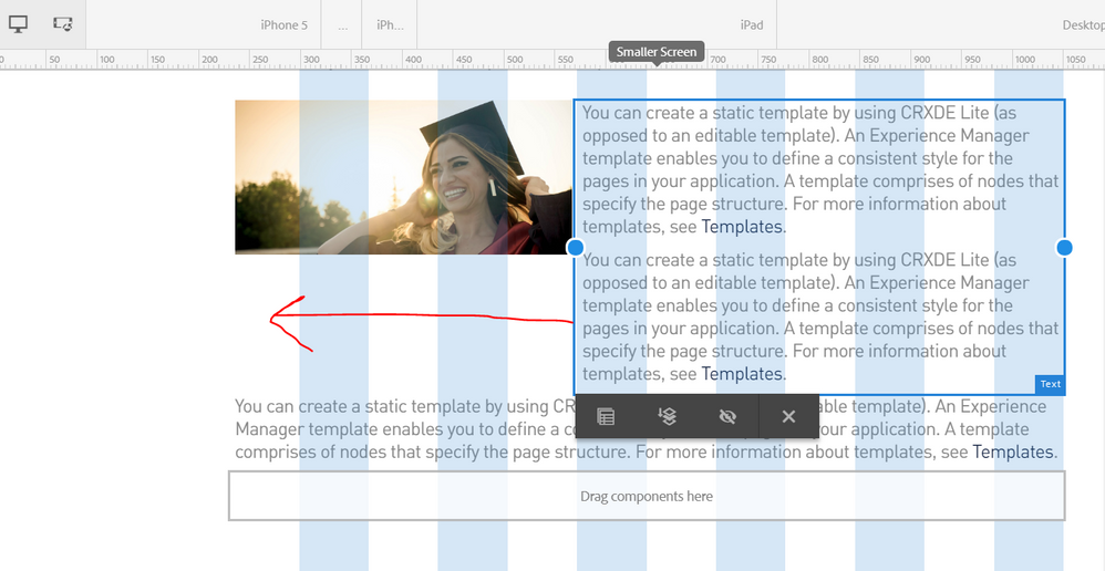
When trying to implement the AEM Grid system on a site, is it possible to allow content to flow around another component based on that component's size in the Grid? It seems that the text component can only be either 100%, or the width that you set in the Grid, no fluidity.
I've attached a screenshot as an example.
Thanks!
Solved! Go to Solution.

- Mark as New
- Follow
- Mute
- Subscribe to RSS Feed
- Permalink
- Report
Hi Matthew,
as these two are 2 different components (image and text) it’s not possible to overflow one on the other.
2 ways to handle this.
1. Combine this to one component ‘imageText’ and handle it via css style
2. Break the text component to 2 text components and add the content accordingly
- Mark as New
- Follow
- Mute
- Subscribe to RSS Feed
- Permalink
- Report
See this section of the Weekend tutorial - where this is covered.
Getting Started with AEM Sites Chapter 3 - Client-Side Libraries and Responsive Grid
It works as you suggested - when you follow the instructions in the doc - you set the width of the grid.
Hope this helps....
Views
Replies
Total Likes

- Mark as New
- Follow
- Mute
- Subscribe to RSS Feed
- Permalink
- Report
Hi Matthew,
as these two are 2 different components (image and text) it’s not possible to overflow one on the other.
2 ways to handle this.
1. Combine this to one component ‘imageText’ and handle it via css style
2. Break the text component to 2 text components and add the content accordingly
- Mark as New
- Follow
- Mute
- Subscribe to RSS Feed
- Permalink
- Report
smacdonald2008 This looks more like creating individual columns for the elements. I'm looking to one layout container that I drag a text and an image component into. From there, using the layout tools, adjust the images width, and have the text from the text component flow around it. As bsloki mentioned, I could create another component to achieve this, however IMO, that seems a bit overkill to simply position an image using the responsive grid.
I'll continue to look for a solution. Thanks for your replies!
Views
Replies
Total Likes


