How to set the padding of Container component in Layout Mode?
- Mark as New
- Follow
- Mute
- Subscribe to RSS Feed
- Permalink
- Report
On my page, I have configured it such that a content author can put down a Container component and place nested components inside. The container component has some margin on either side so that it also exists as the logical "css container", constrained content to the center of the screen.
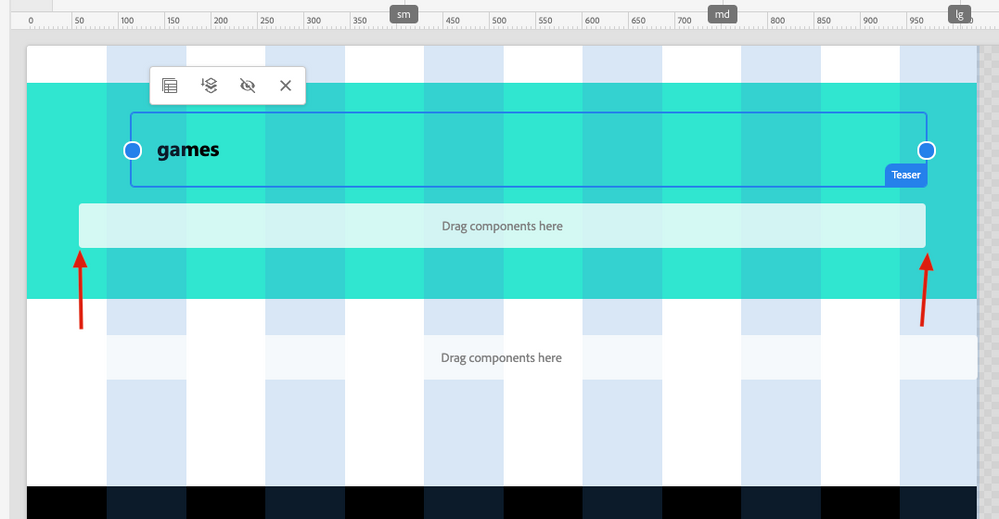
When the content author uses Layout mode, how can I fix the column overlay such that it's constrained to only the available container width? I don't want the width of the entire component, I want the width of the inner "Drag components here" div, so to speak.
Here's an illustration- notice how the column snap points are larger than the available space to place components within.
Solved! Go to Solution.
Views
Replies
Total Likes

- Mark as New
- Follow
- Mute
- Subscribe to RSS Feed
- Permalink
- Report
You need to check exactly which classes are used in layout mode. I have given the code as an example, not the exact code.
You can target the parent DOM element using the title attribute in CSS
Arun Patidar


- Mark as New
- Follow
- Mute
- Subscribe to RSS Feed
- Permalink
- Report
you can do it something like
.mycontainer .cq-Overlay.cq-Overlay--component.cq-droptarget.cq-Overlay--placeholder.is-resizable {
    margin-inline: 3rem;
}
Arun Patidar

- Mark as New
- Follow
- Mute
- Subscribe to RSS Feed
- Permalink
- Report
That's a good idea- basically influence the CSS of the overlay? Where would this CSS snippet go? e.g., how do I get custom CSS added to the editing interface?

- Mark as New
- Follow
- Mute
- Subscribe to RSS Feed
- Permalink
- Report
I have not tested this but it should work if you create a clientlibs with category 'cq.auhoring.dialog'
Arun Patidar

- Mark as New
- Follow
- Mute
- Subscribe to RSS Feed
- Permalink
- Report
So I've added a client lib and set the margin-inline to align with my grid. This works until you go into the layout mode, in which case all of the component overlays (e.g., cq-draggable elements) have their boxes drawn incorrectly with margin offsets. I can't seem to target these in CSS and adjust them correctly because there's nothing really to key off of css wise.
Any ideas?

- Mark as New
- Follow
- Mute
- Subscribe to RSS Feed
- Permalink
- Report
You need to check exactly which classes are used in layout mode. I have given the code as an example, not the exact code.
You can target the parent DOM element using the title attribute in CSS
Arun Patidar

Views
Like
Replies
Views
Likes
Replies
Views
Likes
Replies


