| Request for Feature Enhancement (RFE) Summary: |
Improve the UI of user group management in Touch UI |
| Use-case: |
Authors managing user permissions |
| Current/Experienced Behavior: |
Current UI can be confusing and hard to read |
| Improved/Expected Behavior: |
New UI is simplified and made less confusing |
| Environment Details (AEM version/service pack, any other specifics if applicable): |
AEM 6.5 SP 13 |
| Customer-name/Organization name: |
Qantas |
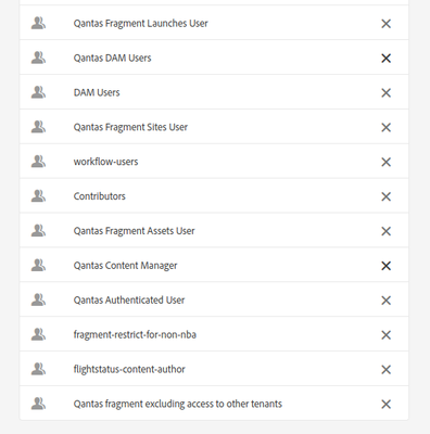
In 6.5 the group management UI can be very confusing compared to 6.3. The UI by default shows all group memberships, including those inherited by other groups. This can be surprising compared to 6.3 which only shows explicit memberships and it makes it a lot less clear what groups the user belongs to. Additionally, the only visual distinction between assigned and inherited group memberships is that the remove button is greyed out on the latter, which is visually very difficult to tell apart and is a bad indicator of which one is which.
I'd like to propose two different solution for this:
1) Instead of greying out the remove button on inherited groups, the button should just be hidden altogether. That would make it very clear which groups can and can't be removed manually.
2) Add a checkbox to filter out the inherited groups. I'd suggest making this disabled by default so it mirrors the 6.3 functionality, then users can optionally check it in order to view the inherited groups that a user has.
Current 6.5 UI (it is very hard to visually distinguish the valid and invalid remove buttons).

6.5 UI with buttons removed (as you can see it is far easier to tell which groups are removable. To improve the UI layout maybe the explicit groups can be sorted to the top so that the buttons aren't at random intervals)
