Join us for the next Community Q&A Coffee Break on Tuesday April 23, 2024 with Eric Matisoff, Principal Evangelist, Analytics & Data Science, who will join us to discuss all the big news and announcements from Summit 2024!
I've created a visitation trend line in Workspace. However, I'm not sure what the dotted line and shaded area represents. Does anyone have insight to this? Below is a screen shot:
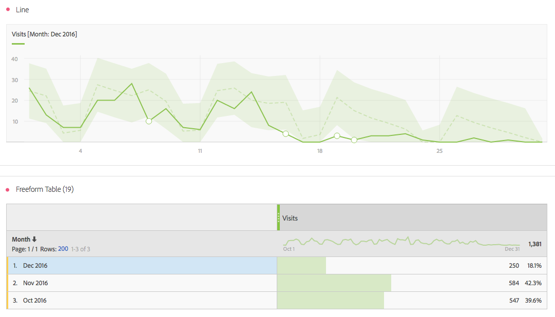
The dotted line show the expected value for the period (here day). The shaded region is the area between the lower and upper bounds of the expected value.
If the actual value goes outside the shaded region it is considered to be an anomaly. In the graph these points are marked by a unfilled circles. On the graph shared, there are four such points.


