Workspace project without numbers

- Mark as New
- Follow
- Mute
- Subscribe to RSS Feed
- Permalink
- Report
a few days ago i published a blog article in german as a response to the "no number" challenge from jexnerW4D. i translated the whole text since i think it is useful for all of the adobe community. feel free to add comments what you think about the ideas below.
„No Number“ challenge – vision and reality
The improvements in Adobe Analytics and especially in Analytics Workspace have been great during the past month. While taking the first steps in Workspace projects it has been common that it was just a mix up of different tables. So basically it was just the same as you can see in the normal reports, but all together on one (or more) screens.
By the time more and more features where implemented which allowed to do custom visualization and custom calculation. The improvements with calculated metrics, segments and date ranges have been a great help both for analysts and for marketers.
The challenge: as simple as possible
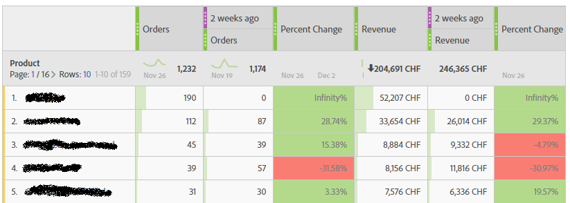
One of the biggest challenge still isn’t solved. In a single table you can just mix up data in a limited way. Just have a look at the following example: if you are interested in products or revenue you can create a table with some comparisons. But you are limited to the width of the screen how many columns you add – just in case you want to be able to read the different numbers or the column descriptions.
If you want to add more columns in this table you sooner or later run out of space. But how can I add more information to the table without making it more complex? Wouldn’t it be great if I can add even a goal for each single metric and some comparison on how well I achieved it? Or if I want to be more radical: just the target and a result, which might look as this:
First solution for the „no numbers“ challenge
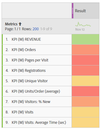
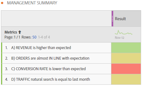
Inspired by the „no numbers“ challenge (Link, in German) by Jan Exner and some other blogs and post I tried to find a solution for a very simple table. It should just show the results for different KPI, depending on the target defined by business. After a lot of work I finally managed to publish the following table – it is my first solution to the challenge:
I am quite excited how easy it looks – the colors indicate how good or bad each single metric has done in the reporting timeframe. And the whole table doesn’t have one single number, just indications on the past – that’s the main idea of the challenge and I solved it.
The solution: creating a KPI table
To create this simple table with coloring is really simple: you just need a custom date range and name it in a way you want (I took “result”, could be “achievements” as well). It is important that the date range is big enough to have all data which you need for calculation later on. This is due to the fact that in workspace the date ranges influence the data that is available in the column. I’ve chosen a date range of the last 12 month, but you could as well take a date range that lasts even longer.
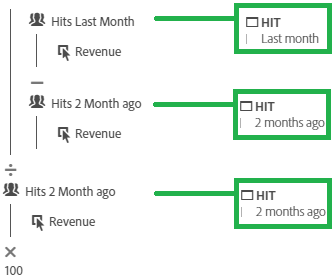
Each single calculated metric in the rows just calculate some values. The result must be a number which is in a metric system similar for all metrics. I have defined in color formatting for the column a high of +1 and a low of -1. Therefore all metrics need to end up with a value bigger than 1 for good and lower than -1 for bad (or anywhere between if you want). A calculated metric for revenue could look like you see in the following picture.
This simple metric just calculates the change from the last month compared to the month before. I added the segment definition I used in the calculated metric in case someone want to use it. And the final multiplication is due to the fact that 1% improvement is good – defined by business. In the same way you can add more calculated metrics just as you want and whatever the metric is (points, time or currency)
No numbers - really?
I admit, living without numbers is really difficult. Sooner or later someone will arrive asking for the real numbers, especially when talking about revenue. But why not? Just add a simple “number” on top of this table for the revenue in a currency. And below you add some metrics which might be a game changer on the way to revenue, every single metric just indicating what is good or bad. Just a few examples: first time shoppers, visitors from search engines, time from start until order submition, or whatever you think might be relevant.
Talking to business there is even one more problem. In most cases there is no real goal to achieve (or the goal happens offline and can’t be measured with digital analytics directly). In this cases the business is interested in creating an increase in visits and customer engagement – believing that a higher visit number will automatically lead to more (offline) revenue.
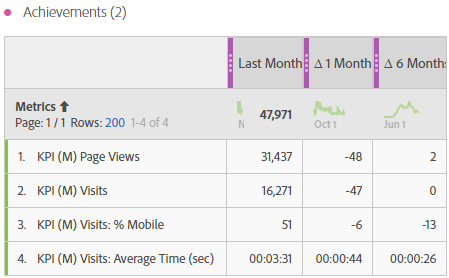
Therefore I was looking for another way to create a table which shows the real numbers and some date comparison. Could I create a table in the same way, but instead of just having the results I want some real data and comparisons, eg. month change or something similar. After a while I managed to create the following table.
In this table I have different metrics in the rows (all mixed metrics: counter, time and even curreny is possible). Beside from the real number for the last month I have more columns showing the change to the month before and a comparison the the rolling 6 month average. How is that possible? Did I fake it?
“fake date ranges”
Fake is the right term. The solution for the table above is a combination of “date ranges” (columns) and “calculated metrics” (rows). But the date ranges have a fake name that doesn’t do what they suggest, they are a filter for the data in a single column.
Having a closer look at the table you could see two things: first, in each row you have a metric in mind and want to show different things about this metric, eg. a real number in the first column and some changes on time in other columns. So all you need for the metric is a way on how you can know in which column you are and show the right number. Or in other words you need a simple “if field 1 show number 1, if field 2 …”
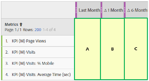
The second thing you could imagine are the fake date ranges. If you look at the columns you can see the color for date ranges – at least if you are used to analytics workspace. To make it simpler to understand I just marked three different time ranges (A, B, C) in the next picture but changed the naming to whatever I want (see column header). Remark: I added more text to the custom date ranges but this text is not visible in the workspace. This additional text is a big “FAKE – DO NOT USE” – just in case I or someone else try to use this date range in another place within adobe analytics, eg. as a time range for the whole workspace project.
This time ranges must fulfill the following conditions:
- The time range must have all data you need for calculation (explained above). For example, if you want to show the values for the last month, the date range must be at least the full last month
- Within each time range it must have at least one page view or hit (will explain later)
- All fake date ranges must be different (will explain later)
Calculated metrics – do whatever you want
Next, let’s have a look at the calculated metrics for the rows. The solution is that each column of the final table has just data of a defined time period. This way, you can check within the calculated metric what data you have (see point 2 above) and show the corresponding number for the column. And if you start to check with a time range that can only be in one “date range”, you know exactly where you are (see point 3 above).
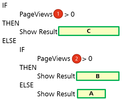
I tried to visualize the solution: you first check if you have data at point (1). If yes, you know that you are in date range (C). if not, check for data point (2). If you have data here, you are in date range (B), else date range (A).
The logic for the calcutalted metric for this example might be the following:
As you might know you can calculate almost everything within calculated metrics. You just add your formula where the “show result” is.
Combine “fake date ranges” and “calculated metrics”
Finally you just mix your new date ranges and calculated metrics in one table. Without any further steps the table looks like this:
As you can see the table just shows the desired numbers in each row. Do not bother about the different format in each row, just don’t show the “numbers” and add some color formatting and you have the final table.
Below is an example where I created three similar tables (all in the same way) and some calculated metrics.
If you want you can even add a “Target” and “Achievement” instead of the month changes. it all depends on what you want to show and what the business requirements are – maybe limited until you tried if you can get more out of adobe workspace…
A bonus for you
I want to mention one special thing at the end of this article. A breakdown of the calculated metric is still possible! if you want to see the revenue broken down by product, you can see the numbers for each single product (in my case where a fully calculate changes). Unfortunately this doesn’t work for goals out of the box (but you might create some more if clauses within the metrics for each product and sum it up… good luck!). Here’s an example of a breakdown for mobile visits:
Be aware of limitations!
Finally some limitations for this solution:
- The sum for each Col doesn’t make sense in most cases. If you have it small enough, the sum disappears. But in most cases I had no problem explaining the business that they shouldn’t look at the column totals.
- The calculated metric only works if you have data at each single point where you make your checks. That means, my table above only works when I have at least data for the last 3 month. if not, it shows the same numbers in columns (B) and (C).
- For each table you are limited to the time frames you defined as columns. If you want to use it take enough time to think about what “fake” date ranges you want to use. A change later on might be difficult or might be a lot of work…
- The time range of a workspace project (as you can select on the top right) has no effect on the table. This means that whatever time range you select for the report, the table and the numbers are always the same. Therefore, those table might not be the best solution for looking back in data …
- Based on my experience I strongly recommend to use a proper naming, tagging of all metrics, segments and date range you create. Otherwise you might end up in confusion if another user takes one of your components not knowing what it does.
Remark: we have created a new user who just holds all the components related to those dashboards (without sharing the special metrics). This way we don’t get a mess while doing all the other analysis in workspace.
That’s it! Found a good mix between vision of „no numbers“ and showing some data to the business.
Highlight: Text in Workspace projects
After publishing the article I received a feedback from https://forums.adobe.com/people/Till_Buettner and he mentioned his great input at the analytic idols contest. after a short discussion about API-automation I managed to create this table:
To create a table like this you just need 4 calculated metrics with a "custom name" and a static number (any number which you can use for conditional formatting later on). you can even automate this and calculate the text/results in report builder at the start of the month, upload the "result" in the calculated metrics (just replace text and number) just before the report get's sent automatically!
hope you enjoy the highlight and you can create your own ideas...


